
Principal Component Analysis#
This tutorial will cover the basics of PCA (principal component analysis). This is a technique using linear algebra to project a dataset in high dimensions (that is, with a large number of degrees of freedom: \(f(x_1, x_2, ..., x_n)\)) onto a lower-dimensional subspace (that is, with a smaller number of degrees of freedom so that we end up with \(f'(x'_1, x'_2, ..., x'_m)\) with \(m<n\)).
In PCA, the parameters of the data considered are called principal components. We will go into detail about the mathematical underpinning of why this works, show two examples of PCA computation in detail on random data in two dimensions and then in eight dimensions, and then show an example on real life data from the Allen Brain Observatory.
Key Takeaways#
The goal is for readers to understand why PCA works from an analysis viewpoint, to understand the situations in which PCA may be useful, to understand some of the limitations of PCA, and to be able to use numpy to perform PCA.
Motivation: Minimal Information Loss#
To illustrate the process of PCA, we’ll first show how it looks on a simple two-dimensional system without going into detail on each step. This will give you some geometric intuition for what PCA is doing, without getting bogged down in the details of what the steps are. After this, we will do a more detailed and complicated PCA step-by-step, explaining the math and illustrating with code.
We’ll start with some randomly generated data in two dimensions. We’ll be using matplotlib to visualize our data and numpy to generate and perform analysis throughout this notebook, so we’ll import them here.
import numpy as np
import matplotlib.pyplot as plt

data = np.ndarray([2,100])
data[0] = np.random.default_rng().normal(50, 10, size=(1, 100))
data[1] = np.random.default_rng().normal(0, 10, size=(1, 100)) + data[0]

x_range = (data[0].max() - data[0].min())/2 * 1.07
y_range = (data[1].max() - data[1].min())/2 * 1.07

ax = plt.subplot(111)
ax.set_aspect(1)
ax.set_xlim([np.mean(data[0])-x_range, np.mean(data[0])+x_range])
ax.set_ylim([np.mean(data[1])-y_range, np.mean(data[1])+y_range])
plt.scatter(data[0], data[1])
plt.xlabel('Variable 1')
plt.ylabel('Variable 2')
plt.title('Randomly Generated Data')
Text(0.5, 1.0, 'Randomly Generated Data')
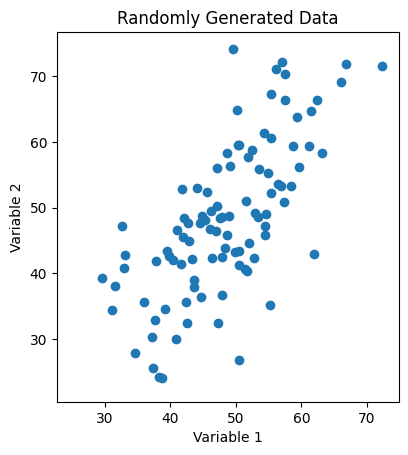
Fig. 1: Scatter plot of randomly generated two-dimensional data with a strong linear correlation between the two variables.
As we can see, our data looks like it has some correlations, which implies that the variables we’re plotting against are not orthogonal (i.e. that one is a function of the other). In the x-direction, our data disperses relatively widely and lays roughly in the range \(x\in[20, 90]\), while in the y-direction, it lays roughly in the range \(y\in[10, 100]\).
{
    "tags": [
        "remove-input",
    ]
}

ax = plt.subplot(111)
ax.set_aspect(1)
plt.scatter(data[0], data[1])
ax.set_xlim([np.mean(data[0])-x_range, np.mean(data[0])+x_range])
ax.set_ylim([np.mean(data[1])-y_range, np.mean(data[1])+y_range])
ax.annotate("",
            xy=(min(data[0]),
                np.mean(data[1])),
            xytext=(max(data[0]),
                    np.mean(data[1])),
            arrowprops=dict(arrowstyle="<->", color="green"))

ax.annotate("",
            xy=(np.mean(data[0]),
                min(data[1])),
            xytext=(np.mean(data[0]),
                    max(data[1])),
            arrowprops=dict(arrowstyle="<->", color="green"))

plt.xlabel('Variable 1')
plt.ylabel('Variable 2')
plt.title('Variance in Each Variable')
Text(0.5, 1.0, 'Variance in Each Variable')
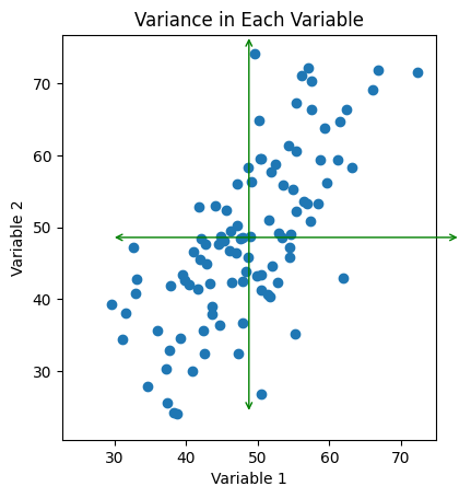
Fig. 2: Scatter plot of data with the range of each variable drawn as green arrows.
If we want to study the spread of our data using the variables we have selected - that is, what we’ve labeled here as ‘Variable 1’ and ‘Variable 2’ - we can observe that both of the lines we have here are both pretty long. That is to say, the variance in the x and y directions both capture a sizable chunk of the variance in our dataset. If we are interested in studying the variability of say, just the x-direction and we compress our data onto that axis, we destroy a lot of information encoded in our dataset - in fact, all of the variance encoded in the y-direction! Conversely, if we were to study only the variance in the y-direction, we would destroy all of the information that the x-direction encoded! Moreover, we would lose any sense of the way in which the variables are correlated with one another. Clearly, this is not the way to go if we want to reduce our data down to one dimension while also preserving most of the information we gathered - after all, the whole point of our experiment was to understand the correlations!
So our question is then if there is a less destructive way to project our dataset onto one dimension? One obvious observation we can make is that there is a particular direction that our data tends to “cluster” around in this simple two-dimensional example.
{
    "tags": [
        "remove-input",
    ]
}

cov_simple = np.cov(data[0], data[1])
lambda_, x = np.linalg.eig(cov_simple)
lambda_ = np.sqrt(lambda_)

from matplotlib.patches import Ellipse
ell = Ellipse(xy=(np.mean(data[0]), np.mean(data[1])), width=lambda_[0]*6, height=lambda_[1]*6, angle=np.rad2deg(np.arctan(x[1,0]/x[0, 0])), edgecolor='r', facecolor='none')

ax = plt.subplot(111)
ax.set_aspect(1)
ax.set_xlim([np.mean(data[0])-lambda_[0]*6, np.mean(data[0])+lambda_[0]*6])
ax.set_ylim([np.mean(data[1])-lambda_[1]*4, np.mean(data[1])+lambda_[1]*3])
plt.scatter(data[0], data[1])
ax.annotate("",
            xy=(min(data[0]),
                np.mean(data[1])),
            xytext=(max(data[0]),
                    np.mean(data[1])),
            arrowprops=dict(arrowstyle="<->", color="green"))

ax.annotate("",
            xy=(np.mean(data[0]),
                min(data[1])),
            xytext=(np.mean(data[0]),
                    max(data[1])),
            arrowprops=dict(arrowstyle="<->", color="green"))
ax.annotate("",
            xy=(ell.center[0] - ell.width/2 * x[0,0],
                ell.center[1] - ell.width/2 * x[1,0]),
            xytext=(ell.center[0] + ell.width/2.5 * x[0,0],
                    ell.center[1] + ell.width/2.5 * x[1,0]),
            arrowprops=dict(arrowstyle="<->", color="red"))
ax.annotate("",
            xy=(ell.center[0] - ell.height/2 * x[0,1],
                ell.center[1] - ell.height/2 * x[1,1]),
            xytext=(ell.center[0] + ell.height/2.25 * x[0,1],
                    ell.center[1] + ell.height/2.25 * x[1,1]),
            arrowprops=dict(arrowstyle="<->", color="red"))

plt.xlabel('Variable 1')
plt.ylabel('Variable 2')
plt.title('Maximized / Minimized Variance')
Text(0.5, 1.0, 'Maximized / Minimized Variance')
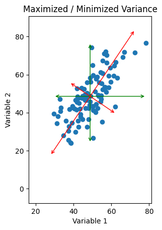
Fig. 3: Scatter plot of data with alternate orthogonal axes drawn in red. Here, the length of one arrow is maximized to capture the “range” in that direction, while the length of the other is minimized. Compare with the original green axes.
If instead of drawing the arrows capturing the spread of the data parallel to the variables, we draw them drawn at an angle, we can pick some directions so that one line is as long as possible and the other line is as small as possible. The line describing each is now some combination of our variables, so that we have two functions of the form \(\text{Variable 2} = m(\text{Variable 1}) + b\) which describe the two lines we’ve drawn here, and they intersect each other at an angle of \(\frac{\pi}{2}\).
All we’ve done here is rotated our axes. Instead of using ‘Variable 1’ as our x-axis and ‘Variable 2’ as our y-axis, we’re now using some combination of the two \(a(\text{Variable 1}) + b(\text{Variable 2})\) for the x-axis and a different combination for the y-axis. However, the point is that we can pick the degree by which we rotate to be whatever makes the spread in our new \(x'\) direction as big (as small) as possible, and the spread in our new \(y'\) direction as small (as big) as possible.
Now, if we’re using these new directions, we can compress our data down onto the longer axis. This results (again) in only one dimension to analyze (since a line is a one-dimensional object). But if we’ve chosen our angle correctly, the amount of information that we are discarding (the length of the smaller axis) is as small as possible! So by a clever change of axes, we can minimize the information loss associated with our dimensionality reduction.
The obvious question to ask now is how we select the correct angle. This is what PCA is designed to do.
PCA in Two-Dimensions#
Let’s take a look at our dataset from above again. The first thing to notice is that the structure of the data will uniquely specify the angle we should pick to rotate by. Obviously, all data will have different correlations and different variances, so every set we could use will lead us to use a different rotation. Additionally, the rotation we want to pick is ultimately based on maximizing and minimizing the variance in each direction. So however we pick the rotation should be based at least in part on the variance in our data.
There are two kinds of variances in any data we can look at. The self-variance, which roughly encapsulates how spread out the measurements of that variable are, and the covariance, which encapsulates how much we can expect to see two variables change together (co-vary). If we look at the axes we’ve drawn in Fig. 3, it looks a lot like the longest axis also happens to be in the direction that the data looks like it’s correlated! So this is a hint that the covariance is closely tied to what we’re looking for. The covariance between two variables is defined \(C_{ab} = \langle(y_a - \bar{y_b})(y_b - \bar{y_b})\rangle\), where the angled brackets denote the expectation value and the overbar denotes the mean value of that variable. So in this particular case, the covariance between what we’ve labeled as ‘Variable 1’ and ‘Variable 2’ is:
\(C = \text{Expectation Value}\{ (\text{(Variable 1)} - \text{Average}\left[ \text{Variable 2}\right] )(\text{Variable 2} - \text{Average}\left[\text{Variable 2}\right] )\} \).
One thing we can also observe is that the self-variance of a variable can be computed as its covariance with itself, e.g. \(C_{aa} = \langle(y_a - \bar{y_a})^2\rangle\). In this particular case, then, we have four numbers that will encode all the information in our system:
\(C_{11}\), the covariance of ‘Variable 1’ with ‘Variable 1’ (i.e. the self-variance).
\(C_{12}\), the covariance of ‘Variable 1’ with ‘Variable 2’.
\(C_{21}\), the covariance of ‘Variable 2’ with ‘Variable 1’.
\(C_{22}\), the covariance of ‘Variable 2’ with ‘Variable 2’ (i.e. the self-variance).
However, we should also expect that \(C_{12} = C_{21}\), since the relationship between the variables must be symmetric in any self-consistent logical system. So, really, what we have are three numbers by which we can encode all the information about our data’s correlations. We can neatly put this into a compact object by defining the so-called ‘Covariance Matrix’, which is the \(N\) x \(N\) matrix defined such that the \((i, j)^{th}\) entry is given by
\(C_{ij} = \langle(y_i - \bar{y_j})(y_j - \bar{y_j})\rangle\)
We can compute this covariance matrix effortlessly by using numpy, which has a built-in calculator to compute covariances.
cov_simple = np.cov(data[0], data[1])
print(cov_simple)
[[ 81.97530079  77.89834115]
 [ 77.89834115 144.71981318]]
What this result tells us is that for the random data we have above, the self-variance of ‘Variable 1’ is around ninety (the exact value is given by the \((0, 0)\) entry in the matrix), and the self-variance of ‘Variable 2’ is around two hundred (value given by the \((1,1)\) entry). The covariance of ‘Variable 1’ and ‘Variable 2’ is given by \(C_{12} = C_{21} \approx 80\); the entries are equal, as we expect.
So now the question is how to use this to find the correct angle by which to rotate our axes. Let’s take a look at the plot of our data with the new axes again:
{
    "tags": [
        "remove-input",
    ]
}


plt.subplots(1, 2, figsize=(10,5))

ax1 = plt.subplot(1, 2, 1)
ax1.set_aspect(1)
ax1.set_xlim([np.mean(data[0])-lambda_[0]*6, np.mean(data[0])+lambda_[0]*6])
ax1.set_ylim([np.mean(data[1])-lambda_[1]*4, np.mean(data[1])+lambda_[1]*3])
plt.scatter(data[0], data[1])
ax1.annotate("",
            xy=(ell.center[0] - ell.width/2 * x[0,0],
                ell.center[1] - ell.width/2 * x[1,0]),
            xytext=(ell.center[0] + ell.width/2.5 * x[0,0],
                    ell.center[1] + ell.width/2.5 * x[1,0]),
            arrowprops=dict(arrowstyle="<->", color="red"))
ax1.annotate("",
            xy=(ell.center[0] - ell.height/2 * x[0,1],
                ell.center[1] - ell.height/2 * x[1,1]),
            xytext=(ell.center[0] + ell.height/2.25 * x[0,1],
                    ell.center[1] + ell.height/2.25 * x[1,1]),
            arrowprops=dict(arrowstyle="<->", color="red"))

plt.xlabel('Variable 1')
plt.ylabel('Variable 2')
plt.title('Maximized / Minimized Variance')

lambda_, x = np.linalg.eig(cov_simple)
lambda_ = np.sqrt(lambda_)
data_vectors = np.array([data[0], data[1]])

rotation_matrix = np.linalg.inv(-x)

rotated_data = np.ndarray((2,len(data[0])))

for i in range(len(data[0])):
    rotated_data[:,i] = np.matmul(rotation_matrix, data_vectors[:,i])

ax2 = plt.subplot(1, 2, 2)
ax2.set_aspect(1)
ax2.set_xlim([np.mean(rotated_data[0])-lambda_[0]*6, np.mean(rotated_data[0])+lambda_[0]*6])
ax2.set_ylim([np.mean(rotated_data[1])-lambda_[1]*4 + 10, np.mean(rotated_data[1])+lambda_[1]*3 + 10])

plt.scatter(rotated_data[0], rotated_data[1])
plt.xlabel('Axis of Minimal Variance')
plt.ylabel('Axis of Maximal Variance')
plt.title('Rotated Data')
Text(0.5, 1.0, 'Rotated Data')
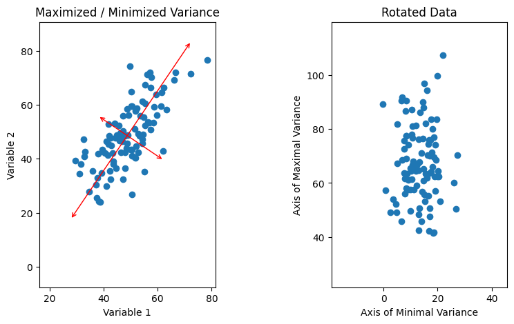
Fig. 4: On the left, our data is plotted with the axes of minimal/maximal variance overlaid in red. On the right, the data is shown plotted on the red axes.
Above, we can see that one striking feature of the data when plotted on the rotated axes is that it appears to have no correlations; in other words, there appears to be no covariance between the new axes. This suggests that in the rotated axes, the covariance matrix should be purely diagonal, with \(C'_{11}\) and \(C'_{22}\) non-zero and \(C'_{12} = C'_{21} = 0\). This is the form of a diagonal matrix, and we can exploit this to figure out how we must rotate using one other mathematical fact. When we perform a linear transformation like a rotation on an \(n\)-dimensional vector space, \(T: V \rightarrow V' = TV\), we also transform linear operators on the vector space so that for an operator \(A: V \rightarrow V\) we have \(A \rightarrow A' = TAT^{-1}\). It is easy to observe that this must be true; since A maps V to V, \(Av \in V\) for all \(v \in V\). Therefore, \(T(Av) = (Av)' = TAv\). The order in which we do these transformations shouldn’t matter since they’re linear. That is, if we act \(A\) on \(v\) and then transform the result using \(T\), we should get the same result as if we use \(T\) to transform \(A\) and \(v\) into \(A'\) and \(v'\) and then act \(A'\) on \(v'\). If we do the latter of these according to the rule we’ve posited, we get \(A'v' = TAT^{-1}Tv\). Since \(T^{-1}T = I_n\) by definition, we then get that \(A'v' = TAv = T(Av)\) as we expect.
The upshot of all this is that the transformation that will rotate us to the axes of maximal and minimal variance is precisely the same transformation that will change the covariance matrix into a diagonal form. This is very useful to us because the process by which we find the correct transformation to diagonalize a matrix is very easy and involves the matrix ‘eigendecomposition’. Note that not every matrix may be diagonalized. However, the covariance matrix is symmetric and semi-positive definite by construction, and so always admits a ‘nice’ diagonalization.
An \(N\) x \(N\) square matrix \(A\) is a linear operator on an \(N\)-dimensional vector space \(V\) over some field \(K\). Its action on any \(v \in V\) can effectively be seen as a rotation on \(v\) and a scaling by a quantity \(k \in K\); in other words, \(Av = k Rv\) where \(R\) is a norm-preserving operator \(R: V \rightarrow V\). There is a special subset of elements \(x \in V\) for any given \(A\) where the rotation is the identity, that is, the action of A on \(x\) is \(Ax = \lambda 1_N x = \lambda x\). After acting with \(A\), the vector still points in the same direction, and has only been scaled by some amount \(\lambda\). An element of this special subset is called an ‘eigenvector’ (notice that since for a given \(x\) any \(kx\) will also be an eigenvector, we identify all \(x\) that can be written as \(kx\) as equivalent). The amount that the vector is scaled by, \(\lambda\), is called the ‘eigenvalue’. The cardinality of the subset is less than or equal to the dimension of the vector space \(N\), and each eigenvector is associated with its own eigenvalue so that we can write \(Ax_i = \lambda_i x_i\) where \(i\) labels which eigenvector we are looking at. A little bit of jargon: the set of eigenvalues for a matrix is called its ‘spectrum’. An example is shown below for a simple matrix.
A = np.array([[0,2],[2,0]])
print('The matrix we are examining is:')
print(A)
print('\n')

v = np.array([[3],[2]])
print('It acts on two-dimensional vectors so that if we act on')
print(v)
print('\n')

print('We get: ')
print(np.matmul(A, v))
print('Which points in a different direction than the original vector')
print('\n')

x = np.array([[1], [1]])
print('But if we act on')
print(x)
print('\n')

print('We get: ')
print(np.matmul(A,x))
print('Which is equal to two times the original vector and points in the same direction. So one of the eigenvalues is 2 and its associated eigenvector is (1,1)')
The matrix we are examining is:
[[0 2]
 [2 0]]


It acts on two-dimensional vectors so that if we act on
[[3]
 [2]]


We get:
[[4]
 [6]]
Which points in a different direction than the original vector


But if we act on
[[1]
 [1]]


We get:
[[2]
 [2]]
Which is equal to two times the original vector and points in the same direction. So one of the eigenvalues is 2 and its associated eigenvector is (1,1)
Ultimately, finding the eigendecomposition of a matrix tells you every piece of information the matrix encodes. In particular, one result of finding the eigendecomposition is that if a matrix admits a diagonal form, the entries of the diagonalized matrix are given by the eigenvalues, and the transformation that takes us to the diagonal form is the matrix formed by setting the eigenvectors as entries in a row vector. So all we have to do to find the correct axes for our data is to perform an eigendecomposition on our covariance matrix, and numpy even comes with a built-in eigensolver, which we’ll use here:
lambda_, x = np.linalg.eig(cov_simple)

print(lambda_)
print(x)
[ 29.36916683 197.32594713]
[[-0.82872654 -0.55965376]
 [ 0.55965376 -0.82872654]]
The first line gives us the eigenvalues of our covariance matrix. Since in this example we only have two variables, ‘Variable 1’ and ‘Variable 2’, resulting in a two by two covariance matrix, we expect no more than two eigenvalues, which is what we have. If we were working with a higher-dimensional dataset (for example, if we were analyzing the correlations between a couple hundred units, say), we would expect far more eigenvalues and a much larger covariance matrix. The value of the eigenvalues correspond to the amount of variance associated with the eigenvector.
The matrix below should be interpreted as two column vectors, so that the eigenvectors are:
print('Eigenvector 1:')
print(x[:,0])
print('\n')
print('Eigenvector 2:')
print(x[:,1])
Eigenvector 1:
[-0.82872654  0.55965376]


Eigenvector 2:
[-0.55965376 -0.82872654]
They are ordered in the same way as the eigenvalues, so that the first eigenvalue corresponds to the eigenvector indexed by [:,0] and the second eigenvalue is the one associated with the eigenvector indexed by [:,1].
One other observation we can make is that since the transformation matrix is composed of the eigenvectors and is acting on our original basis of \((0,1)\) and \((1,0)\), we can read off the new axes directly from the eigenvectors, so that the eigenvectors are the new axes we are looking for. Their associated eigenvalues tell us how much variance is associated with that axis.
In our two-dimensional example, we have two axes defined by our two eigenvectors, and one of them accounts for roughly five times as much of the variance as the other. In general, we want to account for that when we actually draw the axes, so the longer axis will be drawn as roughly five times longer than the shorter axis. This, in turn, suggests that we can actually define the covariance with an ellipse, with a major axis given by the axis with the larger variance, and the minor axis given by the axis with the shorter variance:
lambda_ = np.sqrt(lambda_)
from matplotlib.patches import Ellipse
ax = plt.subplot(111)
ell = Ellipse(xy=(np.mean(data[0]), np.mean(data[1])), width=lambda_[0]*6, height=lambda_[1]*6, angle=np.rad2deg(np.arctan(x[1,0]/x[0, 0])), edgecolor='r', facecolor='none')
ax.add_artist(ell)
ax.set_xlim([np.mean(data[0])-lambda_[0]*8, np.mean(data[0])+lambda_[0]*8])
ax.set_ylim([np.mean(data[1])-lambda_[1]*5, np.mean(data[1])+lambda_[1]*5])
plt.scatter(data[0], data[1])
ax.set_aspect(1)
plt.show()
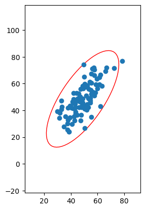
Fig. 5: A plot of the data with a so-called “covariance ellipse” drawn about it. The orientation of the axes of the ellipse is defined by the directions of the axes that maximize and minimize the amount of variance in the data in those directions, and the ratio of the lengths of the axes are defined by the amount of variance in the data in the corresponding direction.
Since the shape of the ellipse is fixed by the eigenvectors and eigenvalues of the covariance matrix, which is in turn fixed by the data, the ratio between the length of its axes and the rotation of the ellipse will be uniquely defined by the data. Note that we can choose to multiply the length of the axes by the same constant without changing the ratio or the orientation. There are particular ways to compute the scale of the axes, but the size of the ellipse is actually irrelevant for our purposes here (though they do have meaning in statistics: see confidence ellipse and prediction ellipse if you’re interested).
Moreover, the axes of the ellipse are the axes which extremize the variance along each axis, as we originally desired:
ax = plt.subplot(111)
ell = Ellipse(xy=(np.mean(data[0]), np.mean(data[1])), width=lambda_[0]*6, height=lambda_[1]*6, angle=np.rad2deg(np.arctan(x[1,0]/x[0, 0])), edgecolor='r', facecolor='none')
ax.add_artist(ell)
ax.set_xlim([np.mean(data[0])-lambda_[0]*8, np.mean(data[0])+lambda_[0]*8])
ax.set_ylim([np.mean(data[1])-lambda_[1]*5, np.mean(data[1])+lambda_[1]*5])
ax.annotate("",
            xy=(ell.center[0] - ell.width/2 * x[0,0],
                ell.center[1] - ell.width/2 * x[1,0]),
            xytext=(ell.center[0] + ell.width/2 * x[0,0],
                    ell.center[1] + ell.width/2 * x[1,0]),
            arrowprops=dict(arrowstyle="<->", color="red"))
ax.annotate("",
            xy=(ell.center[0] - ell.height/2 * x[0,1],
                ell.center[1] - ell.height/2 * x[1,1]),
            xytext=(ell.center[0] + ell.height/2 * x[0,1],
                    ell.center[1] + ell.height/2 * x[1,1]),
            arrowprops=dict(arrowstyle="<->", color="red"))
plt.scatter(data[0], data[1])
ax.set_aspect(1)
plt.show()
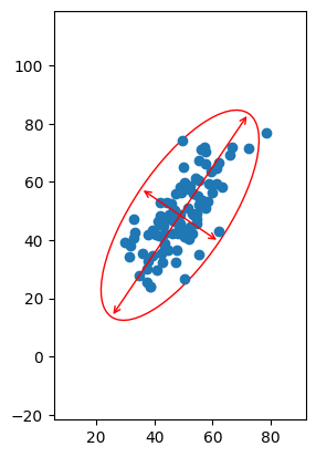
Fig. 6: The data plotted with the covariance ellipse and the major and minor axes overlaid. Notice that the major and minor axes are precisely those that maximize and minimize the amount of self-variance measured along them.
As we can see above, we can use our standard x-y basis to label the coordinates of each point, but we could also label each point’s coordinates according to their values along (semimajor axis, semiminor axis). This doesn’t change the point or the information it encodes, merely how it’s labeled.
So, to summarize, we seek orthogonal axes such that the degree of variance along one axis is maximized and minimized along the other axis. We can find this by computing the covariance matrix and performing an eigendecomposition of it, which metaphorically draws an ellipse around the data. The major and minor axes of the metaphorical ellipse will automatically satisfy the maximize/minimize condition we require. If we wish to study only the biggest contributor to the variance in the dataset, we can then look at the function defining the axis where variance is maximized and we can discard the other axis. This is super useful, because in science we often will work with a tremendous number of variables in which correlations are not immediately obvious. If we can identify particular relationships that are constant or at least close to constant, we can ignore them and focus on the relationships that are correlated, reducing the dimensionality of the data.
Now this is a simple two-dimensional example without working through the real process to illustrate the idea, but the generalization to higher dimensions is immediate; in \(d\) dimensions we will end up with a hyperellipsoid with \(d\) orthogonal axes, such that they can be ordered according to the variance associated with them (in other words, ordered by their eigenvalues, which define their widths in different dimensions). We can then decrease the number of dimensions in the data by removing the \(N\) axes with the smallest contribution to variance and projecting the data onto the subsequent \((d-N)\)-dimensional subspace.
Next, we’ll do an example in higher dimensions, showing the details of how the actual analysis is performed.
An example in higher dimensions, with mathematical details#
Again, we’ll use randomly generated data. Below, we generate using a random Gaussian distribution on our first variable, and then for the following variables we give them linear dependencies on the other variables with random Gaussian noise.
data = np.ndarray([8,100])
data[0] = np.random.default_rng().normal(50, 10, size=(1, 100))
data[1] = np.random.default_rng().normal(10, 10, size=(1, 100)) + 0.2 * data[0]
data[2] = np.random.default_rng().normal(10, 10, size=(1, 100)) + 0.2 * data[1] - 0.2 * data[0]
data[3] = np.random.default_rng().normal(10, 10, size=(1, 100)) + 0.2 * data[0]
data[4] = np.random.default_rng().normal(10, 10, size=(1, 100)) + 0.2 * data[1] - 0.2 * data[0] + 0.2 * data[3]/4
data[5] = np.random.default_rng().normal(10, 10, size=(1, 100)) + 0.2 * data[1] + 0.2 * data[3]/2
data[6] = 6.582 * np.ones((1,100)) # Notice that this "variable" is constant!
data[7] = np.random.default_rng().normal(10, 10, size=(1, 100)) - 0.2 * data[3] + 0.2 * data[5] - 0.2 * data[4]
Again, we will need the covariance matrix, which has matrix elements \(C_{ij} = \langle(y_i - \bar{y_j})(y_j - \bar{y_j})\rangle\). We again compute the covariance matrix using numpy:
cov_mat = np.cov(data)
print(np.matrix(cov_mat))
[[ 1.24316206e+02  1.61704552e+01 -2.67778250e+01  2.24776185e+01
  -3.35297031e+01  3.55473888e+00 -6.50212625e-30 -3.63135245e-01]
 [ 1.61704552e+01  1.01207636e+02  2.19558190e+01  2.88827764e+00
   3.25980649e+01  1.37409571e+01 -6.47025308e-30 -6.39180079e+00]
 [-2.67778250e+01  2.19558190e+01  1.07180371e+02 -2.27962772e+00
   7.62290087e+00  5.82121260e+00 -1.30679988e-30 -5.96068557e+00]
 [ 2.24776185e+01  2.88827764e+00 -2.27962772e+00  1.01801926e+02
  -2.46067052e+00 -8.18923451e+00 -5.03596053e-30 -1.19543350e+01]
 [-3.35297031e+01  3.25980649e+01  7.62290087e+00 -2.46067052e+00
   1.13148715e+02 -1.31400029e+01  1.91239007e-30 -3.06665543e+01]
 [ 3.55473888e+00  1.37409571e+01  5.82121260e+00 -8.18923451e+00
  -1.31400029e+01  8.77767410e+01 -1.65740473e-30  3.13708557e+01]
 [-6.50212625e-30 -6.47025308e-30 -1.30679988e-30 -5.03596053e-30
   1.91239007e-30 -1.65740473e-30  3.18731679e-30  1.19524380e-30]
 [-3.63135245e-01 -6.39180079e+00 -5.96068557e+00 -1.19543350e+01
  -3.06665543e+01  3.13708557e+01  1.19524380e-30  1.13106202e+02]]
To better understand the covariance, we can look at a graphical representation of its values. We should expect that the whole thing is symmetric, as mentioned previously.
plt.imshow(cov_mat)
plt.colorbar()
plt.ylabel("Variable Number")
plt.xlabel("Variable Number")
Text(0.5, 0, 'Variable Number')
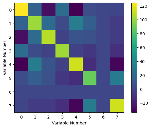
Fig. 7: Covariance matrix as a 3-D plot. Notice that it is symmetric about the diagonal.
Clearly, it is indeed symmetric about its diagonal. From this heat map, we can see how the variables covary with one another. In particular, we can see that the sixth variable (note that the index labeling starts at 0, so that the first item in our list is the zeroth variable), which was constant, has zero variance with every other variable. In some parts of the matrix, we can see negative values, which tell us that the variables vary as the inverse of one another. Finally, the diagonal elements are the variance of the measurements, and we can see that the variance is actually quite high for almost all of our measurements (excepting, of course, the value of the physical constant).
Our next step is to find the principal components (i.e. the eigenvectors).
eigenvalues, eigenvectors = np.linalg.eig(cov_mat)
print(eigenvalues)
[1.80900186e+02 1.49513962e+02 4.35279078e+01 1.30320051e+02
 6.17198252e+01 8.35920987e+01 9.89637661e+01 3.18731679e-30]
As a reminder, the eigenvectors are returned as columns, so that the \(i^{th}\) eigenvector is accessed using eigenvectors[:, i]. We can plot our eigenvalues to see our principal values:
plt.plot(eigenvalues)
plt.xlabel("Eigenvalue Number")
plt.ylabel("Eigenvalue Value")
Text(0, 0.5, 'Eigenvalue Value')
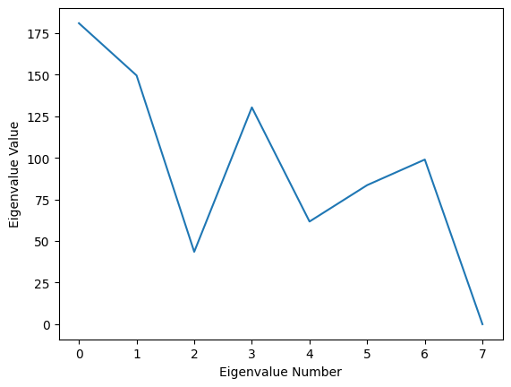
Fig. 8: A plot of the value corresponding to each principal component. Higher values indicate a larger amount of variance in the dataset associated with each.
It is worth taking a step back to discuss the physical interpretation of these eigenvalues. We have diagonalized the covariance matrix. This amounts to a change of basis on the matrix, which in its regular form is using a basis of variables we measured, which we’ll refer to as the original basis \(\{ x_1, x_2, ..., x_d \}\). By diagonalizing, we have changed to a different set of basis vectors, which we’ll refer to as the covariance basis \(\{ x'_1, x'_2, ..., x'_d \}\). The result is that we lose the easy interpretation of what the \(i^{th}\) covariance basis vector physically means. However, we do retain information about what the \(i^{th}\) covariance basis vector is in terms of the original basis vectors; that is, we can write \(x'_i = \sum_j A_{ij} x_j\) for all \(i\), \(j\), and we know what all the coefficients \(A_{ij}\) are.
In exchange for losing the clear physical meaning of each variable, we get to transform our covariance matrix into a form where each basis vector is orthogonal to the others so that the (uninterpretable) variables are totally uncorrelated. Moreover, the eigenvalues associated with each eigenvector are the amount of variance in the system associated with that eigenvector.
So, for example, in the above, we can see that the \(0^{th}\) eigenvalue is the largest by far. We can take a look at its associated eigenvector:
print(eigenvectors[:, 0])
[-4.98865645e-01  2.43534145e-01  3.38475946e-01 -8.38440959e-02
  6.18504946e-01 -1.75307150e-01  1.13283335e-31 -3.96165906e-01]
What this is telling us is that this particular linear combination of the variables we started with accounts for a very large amount of the variance in the data sample, or, in other words, this particular relationship between our original basis variables explains the largest degree of their correlations and hence is the dominant relationship between our variables. We can compute the exact amount that it accounts for by simply dividing the eigenvalue associated with it by the sum of all the eigenvalues of the covariance matrix (the sum of the eigenvalues is also known as the trace of the covariance matrix \(Tr(C) = \sum_i \lambda_i^C\)):
print(eigenvalues[0]/np.sum(eigenvalues))
0.24167141140409806
So, the principal component has contributions from all our original variables (time, pressure, etc.) except for the Planck’s constant variable, which is pretty much what we expect, since the constant variable is constant and thus should be completely uncorrelated with everything (otherwise, the value of a physical constant would be changing, and our universe would collapse). Moreover, this single eigenvector accounts for a significant portion of the variance in our dataset (how much exactly, of course, will vary from run to run since we generated our data randomly). We can continue by looking at the rest of the eigenvalues to see how much of the variation in the data can be explained using them:
print((eigenvalues[0] + eigenvalues[1] + eigenvalues[2] + eigenvalues[4] + eigenvalues[6])/np.sum(eigenvalues))
0.7142266556717554
Here, we can see that only five eigenvectors (principal components) capture almost all the information about the variance in our dataset. The remaining eigenvectors have associated eigenvalues that are almost zero, and so they contribute very little variance to our data. This means that if we restrict our analysis from eight variables to five, we still keep most of the correlations, while we filter out the variables that are effectively irrelevant or very weakly correlated. In other words, we can reduce from studying eight variables to only studying five. In this particular example, actually, we could continue adding eigenvalues to see that we only need seven total to capture all the variance:
print((np.sum(eigenvalues)-eigenvalues[7])/np.sum(eigenvalues))
1.0
This is in perfect agreement with what we should expect, since one of our variables was not a variable at all, but constant in every trial! In other words, what PCA has told us is that we are looking at more things than we need to in order to understand our data - rather than being eight-dimensional, we can eliminate one dimension entirely and focus on the other seven. We can restrict further to study an approximation of our data, which allows us to focus on the linear combinations of our variables that result in the largest amount of variation in our data, at the cost of discarding some of the correlations. At the end of the day, what we then end up with is an \(n\)-dimensional space, where \(n\) is the number of principal components (eigenvectors) we keep in our analysis.
There is an important caveat here. We are using linear algebra in order to map our data onto some \(n\)-dimensional Euclidean space. Thus, we are implicitly assuming that our data is being taken in a regime where we can approximate the correlations as linear, but generically in the real world, most data will have non-linear correlations. PCA will not capture properties of such a non-Euclidean space, and will overestimate the dimensionality of the space needed to understand the data if your data space is curved or cannot at least be approximated as flat. This does not mean that PCA is not useful for most use cases, only that we should be cognizant that it may believe there is a larger relevant data space than there really is.
An analogy that may help to understand the previous sentences is to think of portion of a simple sine wave. PCA is like attempting to approximate the sine wave with a Taylor expansion. Depending on the size of the interval you’re trying to approximate, you may be able to do it perfectly with only a few terms, or you may need dozens of terms. However, the underlying structure is not actually the sum of a finite number of functions.
When encountering something like this, other methods are necessary to determine the underlying structure of the data space, which we will not detail here.
Anyway, once we know how to reduce the dimensionality of our data, the next step is to actually do the reduction. This means we need to project our data onto the lower-dimensional subspace. For simplicity, let’s suppose we decide that the first two principal components (eigenvectors) are all we need for our analysis. The covariance matrix operates on the data space, but it acts on centered data (recall from the definition that we subtract the means). Thus, we will need our data itself to be centered, which we can do simply by subtracting the means.
means = np.mean(data, axis=1)
centered_data = data - np.transpose(np.tile(means, (100,1)))
Note that the centered data here is an 8x100 matrix, and our eigenvectors are 8x1 vectors:
print("Our centered data is a " + str(centered_data.shape) + " tensor.")
print("Our principal components (eigenvectors) are " + str(eigenvectors[:,0].shape) + " tensors." )
Our centered data is a (8, 100) tensor.
Our principal components (eigenvectors) are (8,) tensors.
We should also see how much of the variance we expect to capture with using only two principal components:
print((eigenvalues[0] + eigenvalues[1])/np.sum(eigenvalues))
0.44141277766617143
To project the data onto the new subspace, we’re going to use the (Euclidean - remember the discussion above!) inner product. The The centered data tensor should be interpreted as a 100-component vector, where each element of the vector is one of our data measurements, expressed as an 8-component vector since there were eight measurements per data point. So we are going to take the dot product of each entry of our 100-component vector with the two principal components we want to study.
What we are doing is drawing a 2-dimensional plane in our 8-dimensional data space, and then projecting every data point onto the plane. The plane is defined by the two principal components we have chosen. The dot product of the vectors projects the original vector (one of the entries in our 100-component vector) onto the principal component. Since the two principal components are guaranteed orthogonal to one another, the projection of the original vector onto the plane is simply the Cartesian product of the projections onto those two PCs. As equations:
\(P(\vec{x_i}\rightarrow AB) = (\vec{x_i} \cdot \vec{A}) \times (\vec{x_i} \cdot \vec{B})\)
Here, \(\vec{x_i}\) is the vector we are projecting, \(\vec{A}\) is the first principal component, \(\vec{B}\) is the second principal component, and AB is the plane spanned by \(\vec{A}\) and \(\vec{B}\). The dot product of \(\vec{x_i}\) and \(\vec{A}\) or \(\vec{B}\) each produces a scalar value. Since the PCs are orthogonal, a simple Cartesian product can be taken to find the coordinates on the plane they span \((P_A) \times (P_B) = (P_A, P_B)\). In the end, we still have one hundred data points, but they now all lay on the same plane.
We are no longer examining the variables that we started with, but linear combinations thereof. We can study what the data looks like on this plane defined by PC1 and PC2 to see if there are any interesting relationships or patterns that appear.
projections = np.dot(np.transpose(eigenvectors[:,0:2]),centered_data)
plt.scatter(projections[0,:],projections[1,:])
plt.ylabel('PC2')
plt.xlabel('PC1')
Text(0.5, 0, 'PC1')
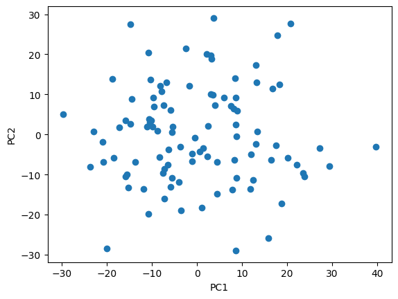
Fig. 9: A plot of the dataset projected onto the first two principal components. In the case of this fake data, we can see that they appear totally uncorrelated.
The above process can be generalized to any number of principal components in the obvious way:
\(P(\vec{x_i}\rightarrow F) = (\vec{x_i} \cdot F_1) \times ... \times (\vec{x_i} \cdot F_n)\)
The projection is now onto the \(n\)-dimensional subspace spanned by the eigenvectors chosen and the analysis is simplified since we are working in a lower-dimensional space. The advantage of using PCA to reduce our dimensionality is that we have discarded as little information (assuming Euclidean data space) as possible to simplify into that lower-dimensional space.
So to summarize the process of PCA:
We begin with some \(d\)-dimensional data space, where each data point has \(d\) measurements associated with it. Because this is a highly complex space, we wish to reduce the number of dimensions to make our analysis more tractable. To reduce the number of dimensions, we cannot just throw away measurements arbitrarily and maintain validity in our analysis. Instead, we will try to figure out which dimensions are irrelevant or minimally relevant to the structure of the data.
We find the minimally relevant dimensions by computing the \(d\times d\) covariance matrix, which encodes the structure of the data. We then compute the spectrum of the covariance matrix, which allows us to identify the minimally relevant dimensions, which are those whose eigenvalues are almost zero.
We discard the minimally relevant dimensions by projecting each data point onto the subspace spanned by the relevant principal components. We then analyze the data in the lower-dimensional space, hoping that we didn’t throw away too much information in the principal components that were not included in our subspace.
Example: Real Data#
Next we can apply PCA to a real life dataset. We’ll use data from the Allen Brain Observatory Visual Coding Neuropixels dataset. We’ll access the data using the Allen SDK and we’ll grab data from a particular session:
import allensdk
from allensdk.brain_observatory.ecephys.ecephys_project_cache import EcephysProjectCache

manifest_path = '/data/allen-brain-observatory/visual-coding-neuropixels/ecephys-cache/manifest.json'
cache = EcephysProjectCache.from_warehouse(manifest=manifest_path)

session_id = 798911424
session = cache.get_session_data(session_id)

units = session.units
unit_metrics = cache.get_unit_analysis_metrics_by_session_type('brain_observatory_1.1')
units_VISp = units[units.ecephys_structure_acronym == 'VISp']
unit_metrics_VISp = unit_metrics.loc[units_VISp.index.values]
/opt/envs/allensdk/lib/python3.10/site-packages/tqdm/auto.py:21: TqdmWarning: IProgress not found. Please update jupyter and ipywidgets. See https://ipywidgets.readthedocs.io/en/stable/user_install.html
  from .autonotebook import tqdm as notebook_tqdm
/opt/envs/allensdk/lib/python3.10/site-packages/hdmf/utils.py:668: UserWarning: Ignoring cached namespace 'hdmf-common' version 1.1.3 because version 1.8.0 is already loaded.
  return func(args[0], **pargs)
/opt/envs/allensdk/lib/python3.10/site-packages/hdmf/utils.py:668: UserWarning: Ignoring cached namespace 'core' version 2.2.2 because version 2.7.0 is already loaded.
  return func(args[0], **pargs)
Here, we’ve accessed the data for all the units recorded in a particular session and filtered for the only units in VISp. Next we’ll also pull up the stimulus presentations table. We’ll focus on drifting gratings and filter for only sessions where we presented drifting gratings, and then we’ll figure out the firing rates for each recorded unit in these trials:
from allensdk.brain_observatory.ecephys.stimulus_table import naming_utilities

def passthrough_function(input):
    return input

naming_utilities.standardize_movie_numbers = passthrough_function
session.naming_utilities = naming_utilities

stimulus_presentations = session.stimulus_presentations
stimulus_presentations_dg = stimulus_presentations[stimulus_presentations.stimulus_name == 'drifting_gratings']

presentations = stimulus_presentations_dg[
            (stimulus_presentations_dg.temporal_frequency == 2.0)]

presentations = presentations.sort_values(by='orientation')
unit_ids = unit_metrics_VISp.sort_values(by=['pref_ori_dg']).index.values

da = session.presentationwise_spike_counts(np.arange(0,1.99,0.01), presentations.index.values, unit_ids)

firing_rates = da.sum('time_relative_to_stimulus_onset').T / 2
max_rates = firing_rates.max('unit_id')
norm_firing_rates = firing_rates / np.tile(max_rates, (len(unit_ids),1))
/opt/envs/allensdk/lib/python3.10/site-packages/hdmf/utils.py:668: UserWarning: Ignoring cached namespace 'hdmf-common' version 1.1.3 because version 1.8.0 is already loaded.
  return func(args[0], **pargs)
/opt/envs/allensdk/lib/python3.10/site-packages/hdmf/utils.py:668: UserWarning: Ignoring cached namespace 'core' version 2.2.2 because version 2.7.0 is already loaded.
  return func(args[0], **pargs)
/opt/envs/allensdk/lib/python3.10/site-packages/allensdk/brain_observatory/ecephys/ecephys_session.py:764: UserWarning: You've specified some overlapping time intervals between neighboring rows: [(3, 4), (5, 6), (8, 9), (10, 11), (12, 13), (13, 14), (15, 16), (16, 17), (17, 18), (19, 20), (20, 21), (23, 24), (25, 26), (28, 29), (31, 32), (32, 33), (35, 36), (37, 38), (38, 39), (39, 40), (40, 41), (42, 43), (44, 45), (46, 47), (47, 48), (53, 54), (54, 55), (55, 56), (56, 57), (63, 64), (65, 66), (66, 67), (68, 69), (70, 71), (72, 73), (75, 76), (80, 81), (82, 83), (85, 86), (86, 87), (88, 89), (89, 90), (91, 92), (92, 93), (94, 95), (95, 96), (96, 97), (97, 98), (100, 101), (102, 103), (104, 105), (106, 107), (108, 109), (110, 111), (112, 113), (113, 114), (115, 116), (117, 118)], with a maximum overlap of 3701.071759999999 seconds.
  warnings.warn("You've specified some overlapping time intervals "
/opt/envs/allensdk/lib/python3.10/site-packages/hdmf/utils.py:668: UserWarning: Ignoring cached namespace 'hdmf-common' version 1.1.3 because version 1.8.0 is already loaded.
  return func(args[0], **pargs)
/opt/envs/allensdk/lib/python3.10/site-packages/hdmf/utils.py:668: UserWarning: Ignoring cached namespace 'core' version 2.2.2 because version 2.7.0 is already loaded.
  return func(args[0], **pargs)
One thing we may be interested in is the correlation between different units. That is to say, do we see some units that usually tend to fire together? This is an example of a very high dimensionality data space, though, since we have many units, each with some particular firing rate. Again, we’ll want to start by computing our covariance matrix:
unit_cov = np.cov(norm_firing_rates)

plt.imshow(unit_cov)
plt.colorbar()
plt.title('Covariance Matrix')
plt.xlabel('Unit')
plt.ylabel('Unit')
Text(0, 0.5, 'Unit')
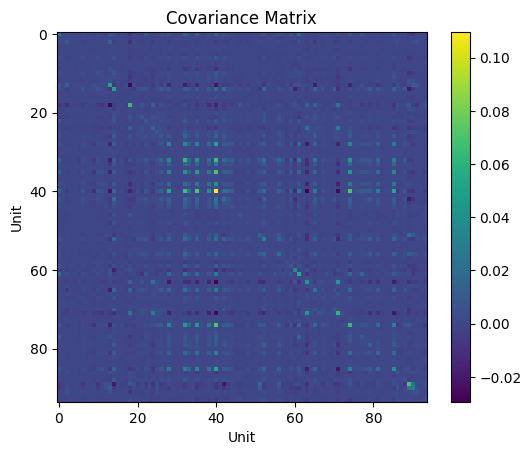
Fig. 10: The covariance matrix for the units in our dataset. Notice here our covariance matrix is now on the order of 100 x 100, a much higher-dimensionality dataset than our previous examples.
Our next step, as usual, is to then perform the eigendecomposition. The eigenvectors we find are what are referred to as “principal components” in the context of this particular type of analysis.
lambda_, eigenvectors = np.linalg.eig(unit_cov)

plt.plot(lambda_)
plt.xlabel('Eigenvector')
plt.ylabel('Amount of Variance Associated')
Text(0, 0.5, 'Amount of Variance Associated')
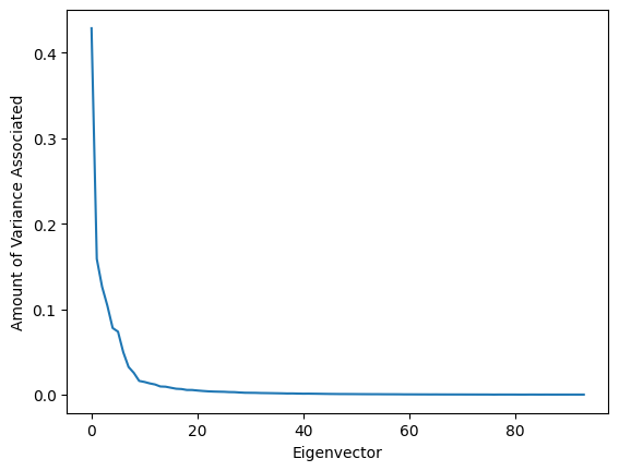
Fig. 11: The amount of variance associated with each principal component. Note that we have 94 principal components this time, since we’re working in a 94-dimensional data space (with 94 units in this dataset) - however, most of these components have almost no variance associated with them! This tells us that instead of needing to consider a hundred different variables, we can probably actually focus on just ten or so to explain most of the correlations in our data.
Next, we can examine the actual eigenvectors to see how our original variables contribute to them. The eigenvectors themselves tell us a particular relationship between our starting variables which accounts for some amount of the variance - in other words, they tell us which (linear) relationships between our original variables best explain the correlations we saw.
plt.plot(eigenvectors[:,0])
plt.xlabel('Unit')
plt.ylabel('Coefficient')
Text(0, 0.5, 'Coefficient')
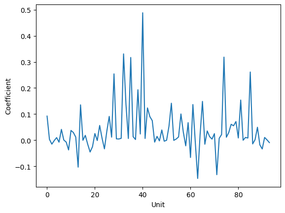
Fig. 12: A plot of the unit contributions to the first principal component. The y-values tell us the coefficient for the unit. For example, here, we see that Unit 39 has a coefficient of 0.5, while unit 17 has a coefficient of -0.1. We also see that there are several units which do not contribute at all, since their coefficients are 0.
Finally, we can project onto a lower dimensional subspace. Let’s suppose that we want to project onto only the first two principal components. We should also check how much of the variance those two components contain.
Notice in the code below, we have to center our data before doing our projection, just like we did in the 8-dimensional example above.
variance_contained = (lambda_[0] + lambda_[1])/np.sum(lambda_)
print('First two PCs explain ' + str(variance_contained*100) + "% of the variance")

mean_rates = np.mean(norm_firing_rates, axis=1)
centered_norm_firing_rates = norm_firing_rates - np.transpose(np.tile(mean_rates, (120,1)))

projected_data = np.dot(np.transpose(eigenvectors[:,0:2]), centered_norm_firing_rates)
orientations = presentations.orientation.values.astype('int')

plt.scatter(projected_data[0,:], projected_data[1,:], c=orientations, cmap='tab10')
plt.title('Principal Components 1 and 2')
plt.xlabel('PC1')
plt.ylabel('PC2')
plt.colorbar(label='Orientation')
First two PCs explain 47.039734783046434% of the variance
<matplotlib.colorbar.Colorbar at 0x7f0b07d853c0>
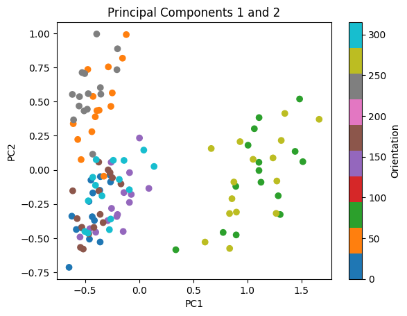
Fig. 13: Plot of the data projected onto the plane spanned by the first two principal components, color coded by the orientation.
Other packages exist to automatically perform PCA, such as in scikit-learn, which has a decomposition attribute containing a PCA class. These packages exist to make the process significantly simpler, since you can just ask the package to perform the dimensional reduction immediately; however, this tutorial should give you an idea of how the module is actually accomplishing what it is doing, and more importantly, why we should believe that the results are valid, and what situations PCA is appropriate for. Other methods of dimensionality reduction exist for non-Euclidean data spaces; though these techniques tend to be far more delicate, they may sometimes be more appropriate. You should always tailor your analysis to the specific subtleties of the dataset you are interested in studying, and the question you are trying to answer!