
Generalized Linear Model (GLM)#
This tutorial will discuss the basics of a generalized linear model (GLM) and showcase some methods for performing a regression with a GLM in Python. This tutorial assumes that you are comfortable with the content included in the regression tutorial.
Motivation#
Ordinary linear regression can be a powerful tool in short-range regimes, but it comes with its own problems. One of the big issues is that the error function used presumes that the data measurements are normally distributed about the predicted value. In other words, we assume that the probability of our recorded measurement being different from the “real” value falls off exponentially with the size of the difference (see the below plot if this is unclear).
The generalized linear model is a method of circumventing this problem. GLMs are finicky and more complicated to get working than standard linear regression models, but are able to model non-linear variance, which may result in enhanced predictive power.
import matplotlib.pyplot as plt
import numpy as np
import scipy.integrate as itgrl
from IPython.display import display, Markdown

ex_outputs = np.linspace(0,10.2,100)
ex_amplitudes = np.exp(-(ex_outputs-5)**2/8)/np.sqrt(4 * np.pi)

plt.plot(ex_outputs, ex_amplitudes)
plt.xlabel('Possible Output Measurements')
plt.ylabel('Probability')
plt.annotate("",
            xy=(5, 0),
            xytext=(5, 0.29),
            arrowprops=dict(arrowstyle="-", color="black"))

itgrl.quad(lambda x: np.exp(-(x-5)**2/8)/np.sqrt(4 * np.pi), 4.9, 5.1)
(0.056395459268300176, 6.261153736397703e-16)
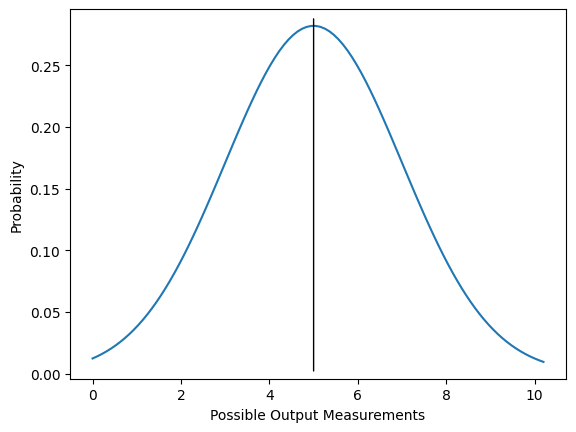
Fig. 1: An example PDF for a particular measurement in a general linear model. The black line at \(y=5\) shows the expectation value of the measurement, which is what we think we will see on average if we do many trials with the same inputs and conditions. The blue curve indicates the probability of the actual measurement; for example, this plot indicates approximately a 5.6% chance of measuring between 4.9 and 5.1 on any given trial. Note that since this is a continuous PDF, \(\lim_{\epsilon\rightarrow 0} \int_{x-\epsilon}^{x+\epsilon} dx P(x) = 0\) and we must always specify an interval in which we wish the measurement to fall.
Theory#
Like in the regression tutorial, we begin with our data, which is a set of \(n\) ordered pairs \((\vec{x_i}, \vec{y})\), with \(\vec{x_i} \in X^n\) and \(y_i \in Y\) for all \(i\in\mathbb{Z^+_0}\), \(0 \leq i \leq n\). We wish to construct a mapping \(f(\vec{x}): X^n \rightarrow Y^n\) such that \(f(\vec{x_i}) \approx \vec{y}\) for all \(i\).
In the regression tutorial, we demonstrated how to compute this under the assumption that we could construct a function such that \(f(\vec{x_j} = \beta_{ij} x_j)\), where \(f(x)\) may be vector-valued or scalar-valued. This is called the general linear model. This should not be confused with what we are studying in this tutorial, the generalized linear model. Sadly, here the nomenclature is confusing.
In the case of the general linear model, we - as previously mentioned - assume that the possible measurements are normally distributed about the mean. This is not always a valid assumption; for example, the range of possible values may be discretized, or bounded from above or below, or subject to non-trivial boundary conditions and surface terms. We can identify the value of \(f(\vec{x})\) with the mean value of a measurement given a set of inputs. So, our general linear model is of form:
\(\mu_i = \beta \vec{x_i}\)
Where \(\beta\) is a (possibly one-dimensional) matrix of coefficients operating on \(\vec{x}\), our set of inputs, and i labels which set of inputs we are looking at.
Now we would like to adjust the probability weighting to be a distribution in the exponential family of our choosing. Clearly, if we are allowed to choose arbitrary distributions, this becomes a very general model that could be used to construct quite a lot of relations, hence the name.
Imposing an arbitrary distribution is a multi-step process. This is subject to a couple of conditions. Firstly, we observe that a general PDF is defined by some parameters \(\theta\) which tell it precisely where and how the probability should be distributed. Since each measurement may have different variances or means associated with them, we will need to construct a PDF to tell us how we should see our observations being distributed for each \(i\) in \(\vec{x_i}\). So, we need some method of computing \(\vec{\theta}\) given a \(\vec{x_i}\), i.e. we want a function or composition of functions such that \(g^{-1}(\vec{x_i}) = \vec{\theta}\).
We will make a slight assumption here - that we can construct a linear predictor upon which \(\theta\) depends. This is an object \(\eta_i = \beta \vec{x_i}\) such that \(\theta_i = \gamma^{-1}(\eta_i)\). This is not a very large assumption, since we are merely supposing that \(\theta\) is or can be approximated by an analytic function that is linear in \(\eta_i\). For example, if the parameter \(\theta\) depends on \(\eta\) like \(\theta = \arcsin (\sqrt{\eta})\), this can be linearized so that \(\sin^2\theta = \beta x\).
Most often, the key parameter we will want to work with is \(\mu\), the mean of the PDF. In order to impose an arbitrary distribution, we will introduce a link function that linearizes the mean as follows:
\(g(\vec{\mu_i}) =\beta x\)
This function may in general be nonlinear, and so we have split our model into both a linear part (the linear predictor) and a potentially nonlinear part (the link function). In other words, rather than assuming our response is linear in the independent variables, we are allowing our response to be any invertible function of our independent variables. This link function may in general have many forms, but for a given PDF, there is always a canonical choice of link function. Note that in the case where the action of g is the identity or scalar multiples thereof, the generalized linear model becomes the general linear model. Once we have our mean, we will then insert it into our probability distribution function and analyze our data according to that model.
# generate some fake Poisson data

rng = np.random.default_rng()
counts = rng.poisson(lam=3, size=10000)
data = np.histogram(counts, bins = 10, range=(0,10))

# plot the data

plt.hist(counts, bins=12, range=(0,12), histtype='bar', align='left', rwidth=0.5)
plt.xlabel('Number of Occurrences')
plt.ylabel('Counts')
plt.show()
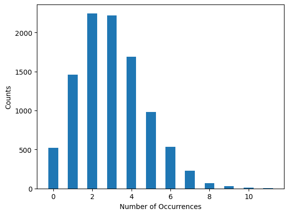
Fig. 2: An example set of measurements where for a given set of inputs, the resulting measurements are not normally distributed about the mean. An example of this might be presenting the exact same stimulus under the exact same conditions to the same mouse, and observing the number of times a particular neuron spiked in a one-second interval.
Example: Generalized linear model for spike train analysis#
A concrete example of where this is useful is in spike train analysis. The number of spikes \(N\in Z^+_0\) is discretized and bounded from below by zero, which will generally rule out a Gaussian distribution. If the spikes are uncorrelated events (that is, the neuron spiking does not change the probability of future spikes), then this precisely matches a Poisson distribution:
\(P(\mu, k) = \frac{\mu^k \exp{(-\mu)}}{k!}\)
Here, \(\mu\) is the expectation value, and k is the number of events. To put some numbers in, we might suppose that we see an average of two spikes per millisecond in a particular neuron; then the probability that we will observe exactly one spike in a given millisecond is \(P(2, 1) = 2 \exp{(-2)} \approx 0.27\); the probability that we will observe at most two spikes within any millisecond interval is \(P(2,0) + P(2,1) + P(2,2)\).
In order to construct our generalized linear model, we will need three ingredients: the distribution, the link function, and the linear predictor. We have already identified our distribution as the Poisson distribution. The link function, as mentioned, may have many forms and how we select it may depend on our data. However, we can always use the canonical link function for a given distribution. For the Poisson distribution, the canonical link function is \(\log(\mu_i) = \beta \vec{x_i}\). With this in hand, the last piece we need to figure out is the linear predictor, \(\beta \vec{x_i}\). We can determine it using scikit-learn. We will then have a complete GLM, with which we can make predictions for other elements in our data space.
To showcase this, we’ll generate some fake data and then attempt to fit it using a GLM.
# sklearn imports necessary
from sklearn.linear_model import PoissonRegressor as PR
from sklearn.model_selection import train_test_split
from sklearn.model_selection import cross_validate
# generate some fake data
num_points = 300
x0 = np.linspace(0, 10, num_points)
def predictor(xt):
return 30 * (np.exp(-0.6 * xt))
def gen_data(xt):
mean = predictor(xt)
return rng.poisson(lam = mean, size = num_points)
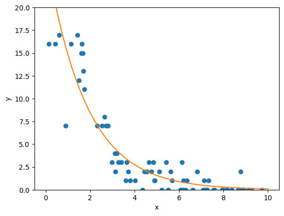
y = gen_data(x0)
fig, ax = plt.subplots()
ax.plot(x0, y, 'o')
ax.set_xlabel('Predictor')
ax.set_ylabel('Counts')
Text(0, 0.5, 'Counts')
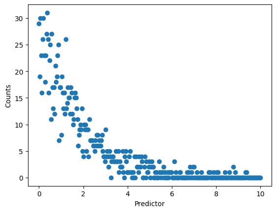
So here, we have a predictor that is continuous (that is, \(x\in\mathbb(R)^+_0\)), but an output that is discrete and bounded from below by zero (that is, \(y\in\mathbb(Z)^+_0\)). We can clearly see that we have some structure to the data, but it looks rather odd, and there’s good reason to suspect that the assumption of a normal distribution (or its discrete analog, rather) is not valid here. In order to set up a model, we’ll follow basically the same concepts discussed in the linear regression tutorial.
Firstly, we’ll need to split our data into a train, validate, and test set. The training set will be the data we use to compute the weights of our models, making sure that it is never exposed to the data in either the validate or test set. We will then use the validate set to compare the performance of our models, again ensuring that the models never see the test set. Finally, once we’ve selected a model, we’ll use the test set to evaluate its predictive power. Since it has never seen the new data at each new step, the model was not constructed to take into account those measurements, and thus they can provide an unbiased evaluator.
x_train, x_validate, y_train, y_validate = train_test_split(x0, y, train_size = 0.5)
x_validate, x_test, y_validate, y_test = train_test_split(x_validate, y_validate, test_size = 0.5)

fig, ax = plt.subplots(1,3, figsize=(15,6))
ax[0].plot(x_train, y_train, 'o')
ax[1].plot(x_validate, y_validate, 'o')
ax[2].plot(x_test, y_test, 'o')

ax[0].set_title('Train')
ax[1].set_title('Validate')
ax[2].set_title('Test')

for i in range(3):
    ax[i].set_ylim(0, 20)
    ax[i].set_xlabel('x')
    ax[i].set_ylabel('y')
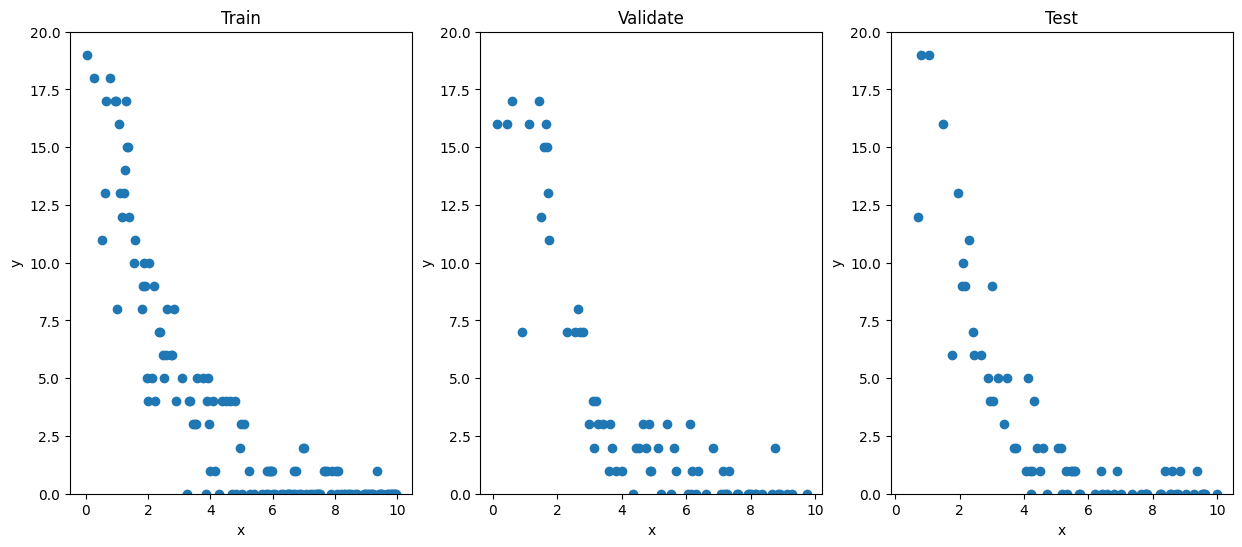
Here, we’ve randomly selected half our data for inclusion in the train set, a quarter of data for the validate set, and the remaining quarter in the test set. We will now use scikit-learn to construct our GLM. We’ll ask it to use a Poisson regressor to construct a GLM. Although it will do all the work for us “behind-the-scenes”, we should remember the theory section so we understand what it’s doing and why it’s doing it so that we are able to adapt to different conditions when necessary! In this case, PoissonRegressor constructs a GLM with the usual three ingredients; it assumes a Poisson distribution and uses a \(\log(\cdot)\) link function to compute the weights in the linear predictor \(\eta = \beta x\).
pr = PR()
pr.fit(x_train.reshape(-1, 1), y_train)
PoissonRegressor()In a Jupyter environment, please rerun this cell to show the HTML representation or trust the notebook.
On GitHub, the HTML representation is unable to render, please try loading this page with nbviewer.org.
PoissonRegressor()
fig, ax = plt.subplots()
ax.plot(x_validate, y_validate, 'o')
ax.plot(x0.reshape(-1,1), pr.predict(x0.reshape(-1,1)), '-')
ax.set_ylabel('y')
ax.set_xlabel('x')
ax.set_ylim(0, 20)
(0.0, 20.0)
So, as we can see, the Poisson regressor predicts a slow exponential decay in our system. Let’s compare it to what a linear regressor would have predicted:
from sklearn.linear_model import LinearRegression as LR

lr = LR()

def nth_polynomial(x, n):
    return np.stack([x**i for i in range(1, n+1)], axis=1)

x_2nd = nth_polynomial(x_train, 2)
lr.fit(x_2nd, y_train)

fig, ax = plt.subplots()
ax.plot(x_validate, y_validate, 'o')
ax.plot(x0.reshape(-1,1), pr.predict(x0.reshape(-1,1)), '-', label='Poisson Regressor')
x_2predictor = nth_polynomial(x0, 2)
ax.plot(x0.reshape(-1,1), lr.predict(x_2predictor), '-', label='Linear Regressor to 2nd Order')
ax.set_ylabel('y')
ax.set_xlabel('x')
ax.set_ylim(0, 20)
ax.legend()
<matplotlib.legend.Legend at 0x7f3c678d62f0>
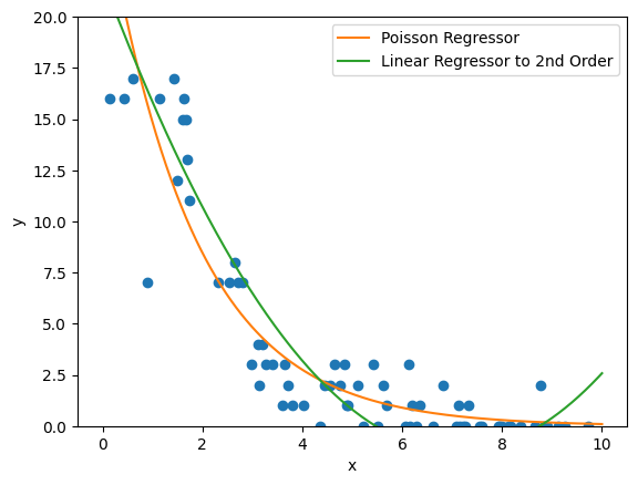
Here, we’re using a linear regressor to second order (so, positing a parabolic relation will suffice for a good approximation of our data). Naturally, there are some issues with this; for one thing, we can already see at the tail that the parabola is starting to lift again, so we can already tell that our model will probably not be valid beyond the interval \([0,10]\) that we’re working with. We could rectify that by going to higher order, but then we will face issues with the possibility of overfitting; as we add more features and weights to suppress odd behaviors in the middle of our data or beyond the interval, the model will become more hyperspecific to the dataset it was trained on. We can also see that the linear regressor predicts negative values on some of our interval, even though the range of our function should be strictly non-negative.
Let’s compare their performance quantitatively using cross_validate.
poisson_error = np.mean(cross_validate(pr, x_train.reshape(-1,1), y_train, cv=4)['test_score'])
linear_error = np.mean(cross_validate(lr, x_2nd, y_train, cv=4)['test_score'])

display(Markdown(rf"""Poisson $R^2$ value: {poisson_error}"""))
display(Markdown(rf"""Linear $R^2$ value: {linear_error}"""))
Poisson $R^2$ value: 0.8973089461196803
Linear $R^2$ value: 0.862354641496749
So as we can see here, the \(R^2\) values show that the Poisson regressor does a relatively better job as compared to the linear regressor. Again, we might be able to improve the linear regressor’s performance by changing the basis to a higher order polynomial. For the Poisson regressor, but we can see that we have already gotten good results from our GLM.
Note that this example was specific to one type of GLM: a Poisson distribution using a logarithmic link function. In general, we will need to select the model we want to use for our GLM based on the features of our data. A list of GLMs supported by scikit-learn can be found here.