Local field potential (LFP)#
The final aspect of a Neuropixels probe recording we will investigate is the local field potential (LFP). An LFP signal is a direct recordings of extracellular voltage from which individual spike contributions have been removed by low-pass filtering. The remaining signal reflects the population activity of a large number of cells in the vicinity of the probe, primarily through the electrical field effects of synaptic currents (along with other trans-membrane currents).
LFP can be especially informative for understanding rhythmic activity or oscillations in neural circuits, which can be identified by some simple time-series analysis of the LFP signals.
Tutorial overview#
This Jupyter notebook will demonstrate how to access and analyze LFP data from the Neuropixels Visual Coding dataset. LFP, which stands for “local field potential,” contains information about low-frequency (0.1-500 Hz) voltage fluctuations around each recording site. It’s complementary to the spiking activity, and can be analyzed on its own or in conjunction with spikes.
This tutorial will cover the following topics:
This tutorial assumes you’ve already created a data cache, or are working with the files on AWS. If you haven’t reached that step yet, we recommend going through the data access tutorial first.
Functions related to analyzing spike data will be covered in other tutorials. For a full list of available tutorials, see the Visual Coding — Neuropixels page.
Let’s start by creating an EcephysProjectCache object, and pointing it to a new or existing manifest file:
Example: Accessing LFP data
We’ll start by loading the LFP data from one of the probes in our session, using the get_lfp function.
We need to provide this function with a probe id, which we can pull out of the session.probes table.
(Note that the “id” column is the index of the dataframe, and thus must be accessed differently than other columns.)
First we access the data for an example session.
import os
import numpy as np
import matplotlib.pyplot as plt
%matplotlib inline
import pandas as pd

from allensdk.brain_observatory.ecephys.ecephys_project_cache import EcephysProjectCache
/opt/envs/allensdk/lib/python3.10/site-packages/tqdm/auto.py:21: TqdmWarning: IProgress not found. Please update jupyter and ipywidgets. See https://ipywidgets.readthedocs.io/en/stable/user_install.html
  from .autonotebook import tqdm as notebook_tqdm
If you’re not sure what a manifest file is or where to put it, please check out the data access tutorial before going further.
# Example cache directory path, it determines where downloaded data will be stored
output_dir = '/root/capsule/data/allen-brain-observatory/visual-coding-neuropixels/ecephys-cache/'
manifest_path = os.path.join(output_dir, "manifest.json")
cache = EcephysProjectCache.from_warehouse(manifest=manifest_path)
session_id = 715093703 # An example session id
session = cache.get_session_data(session_id)
/opt/envs/allensdk/lib/python3.10/site-packages/hdmf/utils.py:668: UserWarning: Ignoring cached namespace 'hdmf-common' version 1.1.3 because version 1.8.0 is already loaded.
  return func(args[0], **pargs)
/opt/envs/allensdk/lib/python3.10/site-packages/hdmf/utils.py:668: UserWarning: Ignoring cached namespace 'core' version 2.2.2 because version 2.7.0 is already loaded.
  return func(args[0], **pargs)
Selecting probes to analyze#
The session object contains all of the spike data for one recording session,
as well as information about the stimulus, mouse behavior, and probes. To
prevent the underlying NWB file from becoming too large, the LFP data is stored
separately, on a probe-by-probe basis. Before loading the LFP, let’s take a look
at the probes that are available for this session.
session.probes
| description | location | sampling_rate | lfp_sampling_rate | has_lfp_data | |
|---|---|---|---|---|---|
| id | |||||
| 810755797 | probeA | See electrode locations | 29999.954846 | 1249.998119 | True |
| 810755799 | probeB | See electrode locations | 29999.906318 | 1249.996097 | True |
| 810755801 | probeC | See electrode locations | 29999.985470 | 1249.999395 | True |
| 810755803 | probeD | See electrode locations | 29999.908100 | 1249.996171 | True |
| 810755805 | probeE | See electrode locations | 29999.985679 | 1249.999403 | True |
| 810755807 | probeF | See electrode locations | 30000.028033 | 1250.001168 | True |
There are six probes available, and all of them have LFP data. Note that there
is a small subset of probes across the entire dataset that only have spike data,
due to high levels of electrical noise contaminating the LFP band. To see which
sessions are missing LFP data, you can check the probes table from the
EcephysProjectCache:
probes = cache.get_probes()

print('Fraction of probes with LFP: ' + str(np.around( np.sum(probes.has_lfp_data) / len(probes), 3) ) )
print(' ')
print('Sessions with missing LFP files: ' + str(list(probes[probes.has_lfp_data == False].ecephys_session_id.unique())))
Fraction of probes with LFP: 0.979

Sessions with missing LFP files: [763673393, 831882777, 839557629]
Returning to the current session, let’s get some information about which brain regions each probe is recording from before we select LFP data to look at in more detail.
Each probe has a unique ID, but the “description” of each probe is assigned based on its location on the recording rig. The Allen Institute Neuropixels rigs have six slot for probes, which are named A, B, C, D, E, and F. The probes are arranged in a ring centered on visual cortex. Probe A is in the anterior/medial position, and the letters go clockwise around the ring.
To visualize what this looks like, we can access the spatial information in this
session’s channels table:
session.channels.keys()
/opt/envs/allensdk/lib/python3.10/site-packages/hdmf/utils.py:668: UserWarning: Ignoring cached namespace 'hdmf-common' version 1.1.3 because version 1.8.0 is already loaded.
  return func(args[0], **pargs)
/opt/envs/allensdk/lib/python3.10/site-packages/hdmf/utils.py:668: UserWarning: Ignoring cached namespace 'core' version 2.2.2 because version 2.7.0 is already loaded.
  return func(args[0], **pargs)
Index(['filtering', 'probe_channel_number', 'probe_horizontal_position',
       'probe_id', 'probe_vertical_position', 'structure_acronym',
       'ecephys_structure_id', 'ecephys_structure_acronym',
       'anterior_posterior_ccf_coordinate', 'dorsal_ventral_ccf_coordinate',
       'left_right_ccf_coordinate'],
      dtype='object')
As you can see, the channels table mainly contains columns related to the
physical locations, either relative to the probe shank
(probe_vertical_position and probe_horizontal_position), or relative to the
Allen Common Coordinate Framework (anterior_posterior_ccf_coordinate,
dorsal_ventral_ccf_coordinate, and left_right_ccf_coordinate). Let’s use a
combination of these to visualize the locations of the probes in this recording.
plt.rcParams.update({'font.size': 14})

x_coords = session.channels.left_right_ccf_coordinate
y_coords = session.channels.anterior_posterior_ccf_coordinate
color = session.channels.probe_vertical_position

f, ax = plt.subplots(figsize=(8,8))
sc = ax.scatter(-x_coords[x_coords > 0], -y_coords[x_coords > 0], c=color[x_coords > 0], cmap='inferno')
cb = plt.colorbar(sc)
_ = cb.ax.set_ylabel('<<  ventral    ---    dorsal  >>')
_ = ax.set_xlabel('<<  lateral    ---    medial  >>')
_ = ax.set_ylabel('<<  posterior    ---    anterior  >>')
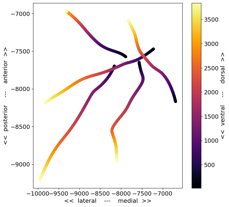
This is a top-down view of the locations of each channel, with the color corresponding to distance along the probe axis (darker = deeper in the brain). A few things to note about this plot:
There are only 5 probes visible, even though there were 6 probes in the recording. This is because one of the probes was not visible in the optical projection tomography volume we use to identify the recording location. If this occurs, the probe will be assigned a 3D CCF coordinate of
[-1, -1, -1], and only cortical units will be given anecephys_structure_acronym.The probe trajectories are curved, as a result of warping to the CCF template brain. The trajectories are straight in the original brain volume.
Some of the probes appear longer than others. This may be due to the viewing angle (in this plot, the more lateral probes are viewed more perpendicular to the insertion axis), or the fact that probes may be inserted to different depths.
To figure out which probe is missing, we can check the probes table for this session:
session.probes.loc[np.unique(session.channels.probe_id.values[x_coords > 0])].description.values
array(['probeA', 'probeC', 'probeD', 'probeE', 'probeF'], dtype=object)
It looks like probeB was not registered to the CCF. That means that probeA
is in the upper right, probeC is in the lower right, and D, E, and F go
clockwise from there. It’s helpful to keep these descriptions in mind, because
probes with the same descriptions enter the brain at roughly the same angle
across experiments. Although the precise target point for each probe depends on
the retinotopic map for each mouse, the overall rig geometry remains the same
across sessions.
Let’s look at the structures each of these probes passes through:
{session.probes.loc[probe_id].description :
     list(session.channels[session.channels.probe_id == probe_id].ecephys_structure_acronym.unique())
     for probe_id in session.probes.index.values}
{'probeA': ['VISam', nan, 'APN', 'MB', 'DG', 'CA1'],
 'probeB': ['grey', nan, 'VISpm'],
 'probeC': ['PO', 'PoT', 'LP', 'DG', 'CA1', 'VISp', nan],
 'probeD': ['LGd', 'CA3', 'DG', 'CA1', 'VISl', nan],
 'probeE': ['PO', 'LP', 'LGd', 'CA3', 'DG', 'CA1', 'VISrl', nan],
 'probeF': ['CA1', 'VISrl', nan]}
In general, probes tend to be inserted through cortex (VIS structures), into
to hippocampus (CA1, CA3, DG), and down into the thalamus or midbrain. If
there’s no CCF registration available (e.g., for probeB in this example),
subcortical structures are marked as grey.
Loading LFP data#
Now that we’ve seen a general overview of how the probes are oriented and what structures they pass through, let’s choose one and load its associated LFP data:
probe_id = session.probes[session.probes.description == 'probeE'].index.values[0]

lfp = session.get_lfp(probe_id)
/opt/envs/allensdk/lib/python3.10/site-packages/hdmf/utils.py:668: UserWarning: Ignoring cached namespace 'hdmf-common' version 1.1.3 because version 1.8.0 is already loaded.
  return func(args[0], **pargs)
/opt/envs/allensdk/lib/python3.10/site-packages/hdmf/utils.py:668: UserWarning: Ignoring cached namespace 'core' version 2.2.2 because version 2.7.0 is already loaded.
  return func(args[0], **pargs)
If you haven’t tried to access this data previously, you’ll have to wait while the LFP NWB file downloads. Even if you already have the data stored locally, it may still take a minute to load, since the LFP data is quite large.
Once the data is loaded, we can take a closer look at the lfp object:
lfp
<xarray.DataArray 'LFP' (time: 12028993, channel: 95)>
array([[-2.43750e-05, -3.08100e-05, -3.19800e-05, ..., -1.95000e-07,
-1.34550e-05, -1.15050e-05],
[-4.44600e-05, -3.31500e-05, -1.42350e-05, ..., 1.95000e-06,
-2.49600e-05, -1.34550e-05],
[-4.58250e-05, 1.17000e-06, -1.42350e-05, ..., 1.36500e-06,
-1.03350e-05, -1.71600e-05],
...,
[-9.59400e-05, -1.54245e-04, -1.06275e-04, ..., 4.89450e-05,
0.00000e+00, 4.09500e-06],
[-1.93050e-05, -7.17600e-05, -4.25100e-05, ..., 6.10350e-05,
-9.75000e-07, 1.15050e-05],
[-2.73000e-05, -7.21500e-05, -6.24000e-05, ..., 3.04200e-05,
-1.95000e-06, -1.95000e-07]], dtype=float32)
Coordinates:
* time (time) float64 13.58 13.58 13.58 ... 9.637e+03 9.637e+03 9.637e+03
* channel (channel) int64 850258492 850258500 ... 850259236 850259244The LFP data is stored as an
xarray.DataArray object, with coordinates
of time and channel. The xarray library simplifies the process of working
with N-dimensional data arrays, by keeping track of the meaning of each axis. If
this is your first time encountering xarrays, we strongly recommend reading
through the
documentation before
going further. Getting used to xarrays can be frustrating, especially when they
don’t behave like numpy arrays. But they are designed to prevent common mistakes
when analyzing multidimensional arrays, so they are well worth learning more
about. Plus, the syntax is modeled on that of the
pandas library, so if you’re familiar with that
you already have a head start.
The print-out above already tells us a lot about what the lfp object contains.
It stores an array with around 12 million points along the time axis and 95
points along the channel axis. The time axis ranges from 13.5 to around 9600
seconds, while the channel axis ranges from 850258492 to 850259244 (these are
the unique IDs for each channel).
Let’s use the DataArray.sel() method to select a slice through this array
between 100 and 101 seconds:
lfp_slice = lfp.sel(time=slice(100,101))
lfp_slice
<xarray.DataArray 'LFP' (time: 1250, channel: 95)>
array([[ 1.50149994e-04, 1.49954998e-04, 1.65749996e-04, ...,
4.68000007e-06, 2.30099995e-05, -1.13099995e-05],
[ 1.64190002e-04, 1.41569995e-04, 1.50734995e-04, ...,
6.62999992e-06, 1.18950002e-05, -1.30649996e-05],
[ 1.43519996e-04, 1.47030005e-04, 1.80959993e-04, ...,
4.48499986e-06, 1.96950004e-05, 8.18999979e-06],
...,
[-2.35949992e-05, -1.63799996e-05, -3.45150002e-05, ...,
1.55999999e-06, -1.48199997e-05, -1.11150002e-05],
[-1.87200003e-05, -5.75249978e-05, -4.93349980e-05, ...,
8.38500000e-06, -2.00849991e-05, -5.26499980e-06],
[-3.17849990e-05, -5.53799982e-05, -4.17299998e-05, ...,
2.14500005e-06, -1.67700000e-05, -2.73000001e-06]], dtype=float32)
Coordinates:
* time (time) float64 100.0 100.0 100.0 100.0 ... 101.0 101.0 101.0 101.0
* channel (channel) int64 850258492 850258500 ... 850259236 850259244We see that this new DataArray is smaller than before; it contains the same number of channels, but only 1250 samples, due to the LFP sample rate of ~1250 Hz.
Let’s plot the data for one of the channels:
plt.figure(figsize=(10,2))
_ = plt.plot(lfp_slice.time, lfp_slice.sel(channel=lfp_slice.channel[50]))
plt.xlabel('Time (s)')
plt.ylabel('LFP (V)')
Text(0, 0.5, 'LFP (V)')

Alternatively, we can visualize this slice of data using matplotlib’s imshow method:
f, ax = plt.subplots(figsize=(8,8))
im = ax.imshow(lfp_slice.T,aspect='auto',origin='lower',vmin=-1e-3, vmax=1e-3)
cb = plt.colorbar(im, fraction=0.036, pad=0.04)
cb.ax.set_ylabel('LFP (V)')
_ = ax.set_xlabel('Sample number')
_ = ax.set_ylabel('Channel index')
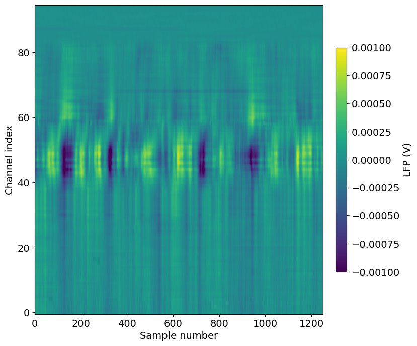
Note that we’ve transposed the original array to place the time dimension along the x-axis. We’ve also configured the plot so that the origin of the array is in the lower-left, so that that channels closer to the probe tip are lower in the image.
A few things to note about this plot:
The units of the LFP are volts, so the color scale ranges from -1 to
Even though there are 384 channels on the Neuropixels probe, there are only 95 channels in this plot. That’s because only every 4th channel is included in the NWB file (resulting in 40 micron vertical spacing). In addition, the reference channels and channels far outside the brain have been removed.
The top of the plot is relatively flat. This corresponds to channels that are outside the brain. The LFP channels are originally referenced to a ground wire embedded in the ACSF/agarose mixture about cortex. Before NWB packaging, the LFP data is digitally referenced to the channels outside the brain, to remove noise that’s shared across the whole probe.
There’s a large increase in LFP power toward the middle of the probe, which corresponds to channels in hippocampus.
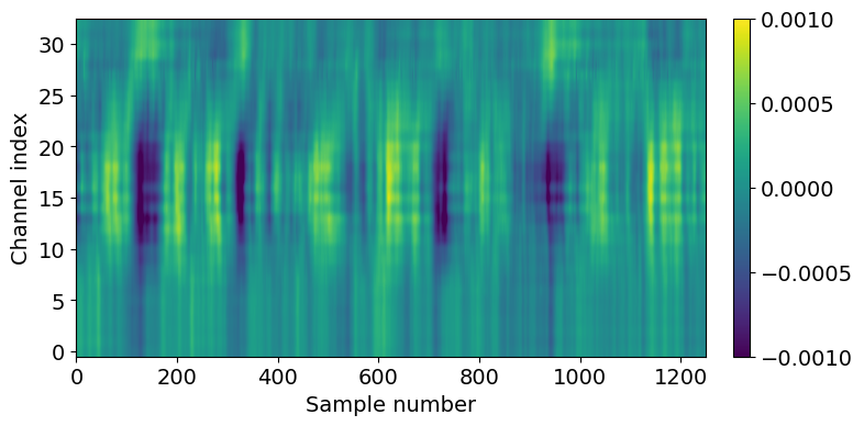
Let’s do some additional data selection to look at just the hippocampal channels from this recording.
channel_ids = session.channels[(session.channels.probe_id == probe_id) & \
(session.channels.ecephys_structure_acronym.isin(['CA1','CA3','DG']))].index.values
lfp_slice2 = lfp_slice.sel(channel=slice(np.min(channel_ids), np.max(channel_ids)))
plt.figure(figsize=(8,4))
im = plt.imshow(lfp_slice2.T,aspect='auto',origin='lower',vmin=-1e-3, vmax=1e-3)
_ = plt.colorbar(im, fraction=0.036, pad=0.04)
_ = plt.xlabel('Sample number')
_ = plt.ylabel('Channel index')
Suggestions for further analysis#
Can you use supervised learning to train a model to accurately identify brain regions based on LFP signals alone? What happens when you use this model to classify brain regions in recordings without CCF registration?
Aligning LFP data to a stimulus#
In the above example, we selected LFP data based on an arbitrary time span (100 to 101 seconds). For many analyses, however, you’ll want to align the data to the onset of a particular type of stimulus.
The AllenSDK provides a number of convenience functions for aligning spikes to visual stimuli. We are planning to implement similar functions for LFP data in the near future. Until then, the steps below will show you how to perform this alignment.
First, we need to select some stimulus presentations to use:
presentation_table = session.stimulus_presentations[session.stimulus_presentations.stimulus_name == 'flashes']
presentation_times = presentation_table.start_time.values
presentation_ids = presentation_table.index.values
/opt/envs/allensdk/lib/python3.10/site-packages/hdmf/utils.py:668: UserWarning: Ignoring cached namespace 'hdmf-common' version 1.1.3 because version 1.8.0 is already loaded.
  return func(args[0], **pargs)
/opt/envs/allensdk/lib/python3.10/site-packages/hdmf/utils.py:668: UserWarning: Ignoring cached namespace 'core' version 2.2.2 because version 2.7.0 is already loaded.
  return func(args[0], **pargs)
Now, we can align the LFP to these presentation times using some xarray “magic”:
trial_window = np.arange(-0.5, 0.5, 1/500)
time_selection = np.concatenate([trial_window + t for t in presentation_times])

inds = pd.MultiIndex.from_product((presentation_ids, trial_window),
                                  names=('presentation_id', 'time_from_presentation_onset'))

ds = lfp.sel(time = time_selection, method='nearest').to_dataset(name = 'aligned_lfp')
ds = ds.assign(time=inds).unstack('time')

aligned_lfp = ds['aligned_lfp']
aligned_lfp is a DataArray with dimensions of channels x trials x time. It’s
been downsampled (however without proper decimation!) to 500 Hz by changing
the time step in the trial_window variable.
Because we’re using xarrays, the alignment operation is fast, and doesn’t
require any for loops! There’s a lot going on here, so we recommend referring
to the pandas and xarray documentation if anything is confusing.
Now we can visualize the average LFP, aligned to the trial onset:
f,ax = plt.subplots(figsize=(8,6))
im = ax.imshow(aligned_lfp.mean(dim='presentation_id'), aspect='auto', origin='lower', vmin=-1e-4, vmax=1e-4)
_ = plt.colorbar(im, fraction=0.036, pad=0.04)
_ = plt.xlabel('Sample number')
_ = plt.ylabel('Channel index')
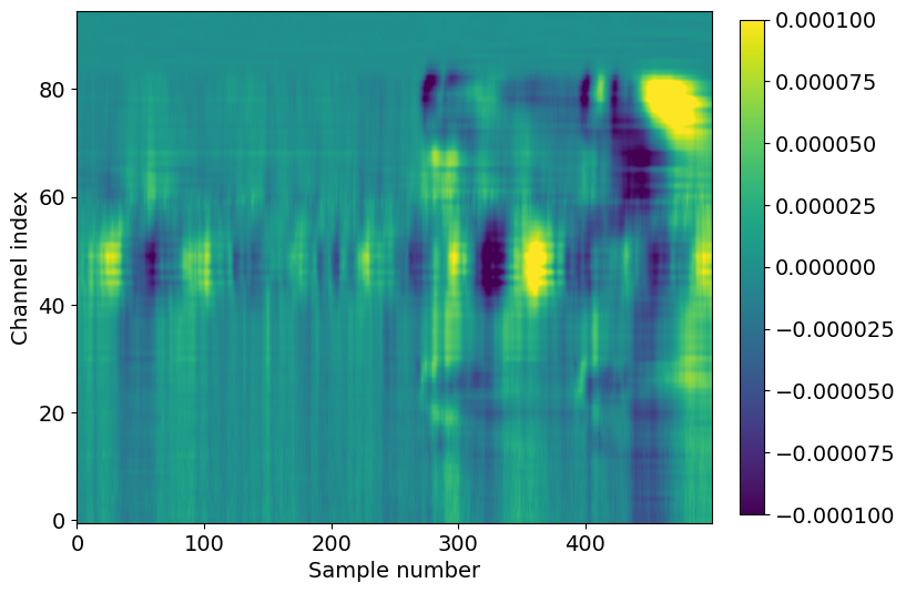
Here we see the effect of a 250 ms flash stimulus on the LFP. There are two large responses in cortex (channel index 60-80), one corresponding to the stimulus onset (around sample 280), and one corresponding to the stimulus offset (around sample 400).
Note that the voltage range is an order of magnitude less than it was for the single-trial LFP, around -100 to
You can use the code sample above to align the LFP to any type of event (e.g.
spike times, running onset, optogenetic stimuli) just by changing the
trial_window and time_selection variables.
Suggestions for further analysis#
How do the time delays of stimulus-evoked LFP deflections vary across areas and depths? Are these delays different for different stimulus conditions?
Are there consistent patterns in the LFP when aligning to the start of running, or the onset of an eye movement?
Aligning LFP data in space to units#
The previous section demonstrated how to align the LFP in time. What if we want to extract the LFP at a particular location in space, corresponding to the location of a unit we’re analyzing?
Let’s start by finding a well-isolated, high-firing rate unit in visual cortex from the probe we’re currently working with. For more information about using quality metrics to assess unit isolation quality, check out this tutorial.
Once we’ve selected a unit of interest, the xarray library makes it easy to find the associated LFP channel.
units_of_interest = session.units[(session.units.probe_id == probe_id) &
                                  (session.units.ecephys_structure_acronym.str.find('VIS') > -1) &
                                  (session.units.firing_rate > 10) &
                                  (session.units.nn_hit_rate > 0.95)]

len(units_of_interest)
4
There are four units that meet our criteria. Let’s choose one and find its associated channel index.
unit_id = units_of_interest.index.values[0]

channel_index = units_of_interest.loc[unit_id].probe_channel_number

channel_index
260
Note that this is the channel index relative to the original probe (out of 384 possible channels), rather than the index of the LFP DataArray.
We can now use the channel index to find the unique channel ID for this unit:
channel_id = session.channels[(session.channels.probe_channel_number == channel_index) &
                              (session.channels.probe_id == probe_id)].index.values[0]

channel_id
850259008
Using unit_id and channel_id, we can select the spikes and LFP within an
arbitrary time interval. Note that we need to use method='nearest' when
selecting the LFP data channel, since not every electrode is included in the LFP
DataArray.
start_time = 500
end_time = 510

spike_times = session.spike_times[unit_id]

times_in_range = spike_times[(spike_times > start_time) & (spike_times < end_time)]

lfp_data = lfp.sel(time = slice(start_time, end_time))
lfp_data = lfp_data.sel(channel = channel_id, method='nearest')
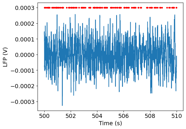
Finally, we can plot the spike times along with the LFP for this interval:
_ = plt.plot(lfp_data.time, lfp_data)
_ = plt.plot(times_in_range, np.ones(times_in_range.shape)*3e-4, '.r')
_ = plt.xlabel('Time (s)')
_ = plt.ylabel('LFP (V)')
Suggestions for further analysis#
What does the spike-triggered LFP look like for different units? Is it possible to classify units based on the properties of the spike-triggered LFP?
How well can you predict spike rates from the nearby LFP signals? Does this vary across different brain regions?
Filtering and spectral estimation of LFP#
We’ll start by plotting the timeseries of a single channel, as we did above.
channel = lfp.channel[50]
lfp_subset = lfp.sel(channel=channel, time=slice(15, 30))

plt.figure(figsize=(12,3))
lfp_subset.plot()
plt.show()

This signal contains components of multiple frequencies. We can isolate a
frequency band of interest by filtering. To do this we’ll want to convert our
data into standard numpy arrays for easier processing using the DataArray
object’s values property.
t = lfp_subset.time.values
v = lfp_subset.values
import scipy.signal
freq_window = (4, 10)
filt_order = 3
fs = 1/(t[1]-t[0])
b, a = scipy.signal.butter(filt_order, freq_window, btype='bandpass', fs=fs)
v_alpha = scipy.signal.lfilter(b, a, v)

f, ax = plt.subplots(figsize=(12,3))
ax.plot(t, v)
ax.plot(t, v_alpha,'k')
ax.set_xlabel('Time (s)')
ax.set_ylabel('LFP (V)')
Text(0, 0.5, 'LFP (V)')

Example: LFP Power spectral density (PSD)
Next we’re going to analyze some spectral properties of this signal using the
scipy.signal library. “Spectral” refers to decomposing a signal into a sum of
simpler components identified by their frequencies. The set of frequencies of
the components forms a spectrum that tells us about the complete signal. You
can see a full list of spectral analysis functions in scipy here:
https://docs.scipy.org/doc/scipy/reference/signal.html#spectral-analysis
We first import the package, and inspect the periodogram function, which
estimates the size of the different frequency components of the signal.
import scipy.signal
help(scipy.signal.periodogram)
Show code cell output
Help on function periodogram in module scipy.signal._spectral_py:

periodogram(x, fs=1.0, window='boxcar', nfft=None, detrend='constant', return_onesided=True, scaling='density', axis=-1)
    Estimate power spectral density using a periodogram.

    Parameters
    ----------
    x : array_like
        Time series of measurement values
    fs : float, optional
        Sampling frequency of the `x` time series. Defaults to 1.0.
    window : str or tuple or array_like, optional
        Desired window to use. If `window` is a string or tuple, it is
        passed to `get_window` to generate the window values, which are
        DFT-even by default. See `get_window` for a list of windows and
        required parameters. If `window` is array_like it will be used
        directly as the window and its length must be equal to the length
        of the axis over which the periodogram is computed. Defaults
        to 'boxcar'.
    nfft : int, optional
        Length of the FFT used. If `None` the length of `x` will be
        used.
    detrend : str or function or `False`, optional
        Specifies how to detrend each segment. If `detrend` is a
        string, it is passed as the `type` argument to the `detrend`
        function. If it is a function, it takes a segment and returns a
        detrended segment. If `detrend` is `False`, no detrending is
        done. Defaults to 'constant'.
    return_onesided : bool, optional
        If `True`, return a one-sided spectrum for real data. If
        `False` return a two-sided spectrum. Defaults to `True`, but for
        complex data, a two-sided spectrum is always returned.
    scaling : { 'density', 'spectrum' }, optional
        Selects between computing the power spectral density ('density')
        where `Pxx` has units of V**2/Hz and computing the power
        spectrum ('spectrum') where `Pxx` has units of V**2, if `x`
        is measured in V and `fs` is measured in Hz. Defaults to
        'density'
    axis : int, optional
        Axis along which the periodogram is computed; the default is
        over the last axis (i.e. ``axis=-1``).

    Returns
    -------
    f : ndarray
        Array of sample frequencies.
    Pxx : ndarray
        Power spectral density or power spectrum of `x`.

    See Also
    --------
    welch: Estimate power spectral density using Welch's method
    lombscargle: Lomb-Scargle periodogram for unevenly sampled data

    Notes
    -----
    .. versionadded:: 0.12.0

    Examples
    --------
    >>> import numpy as np
    >>> from scipy import signal
    >>> import matplotlib.pyplot as plt
    >>> rng = np.random.default_rng()

    Generate a test signal, a 2 Vrms sine wave at 1234 Hz, corrupted by
    0.001 V**2/Hz of white noise sampled at 10 kHz.

    >>> fs = 10e3
    >>> N = 1e5
    >>> amp = 2*np.sqrt(2)
    >>> freq = 1234.0
    >>> noise_power = 0.001 * fs / 2
    >>> time = np.arange(N) / fs
    >>> x = amp*np.sin(2*np.pi*freq*time)
    >>> x += rng.normal(scale=np.sqrt(noise_power), size=time.shape)

    Compute and plot the power spectral density.

    >>> f, Pxx_den = signal.periodogram(x, fs)
    >>> plt.semilogy(f, Pxx_den)
    >>> plt.ylim([1e-7, 1e2])
    >>> plt.xlabel('frequency [Hz]')
    >>> plt.ylabel('PSD [V**2/Hz]')
    >>> plt.show()

    If we average the last half of the spectral density, to exclude the
    peak, we can recover the noise power on the signal.

    >>> np.mean(Pxx_den[25000:])
    0.000985320699252543

    Now compute and plot the power spectrum.

    >>> f, Pxx_spec = signal.periodogram(x, fs, 'flattop', scaling='spectrum')
    >>> plt.figure()
    >>> plt.semilogy(f, np.sqrt(Pxx_spec))
    >>> plt.ylim([1e-4, 1e1])
    >>> plt.xlabel('frequency [Hz]')
    >>> plt.ylabel('Linear spectrum [V RMS]')
    >>> plt.show()

    The peak height in the power spectrum is an estimate of the RMS
    amplitude.

    >>> np.sqrt(Pxx_spec.max())
    2.0077340678640727
There are a number of options that we won’t go into here for refining the
analysis. The one piece of information we do need is fs, the sampling
frequency. If we used the default value fs=1.0 our results would not match the
true frequencies of the signal.
fs = 1/(t[1]-t[0])

f, psd = scipy.signal.periodogram(v, fs)
We’ll plot the power spectrum on a semilog plot, since power can vary over many orders of magnitude across frequencies.
plt.figure(figsize=(6,3))
plt.semilogy(f,psd,'k')
plt.xlim((0,100))
plt.yticks(size=15)
plt.xticks(size=15)
plt.ylabel('Power ($V^{2}/Hz$)')
plt.xlabel('Frequency (Hz)')
plt.show()
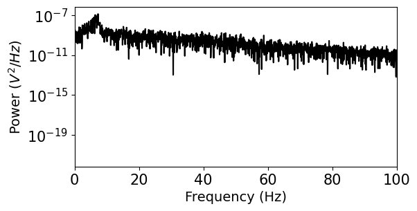
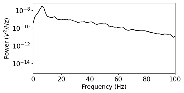
We see that this representation of the power spectrum is extremely noisy. Luckily, many people have come up with solutions to this problem. Scipy includes a function for Welch’s method, which averages out noise by computing many estimates of the power spectrum from overlapping windows of the data. You can find some more references for this approach in the Scipy documentation. For more powerful spectral estimation techniques, try multitaper.
f, psd = scipy.signal.welch(v, fs, nperseg=1000)

plt.figure(figsize=(6,3))
plt.semilogy(f,psd,'k')
plt.xlim((0,100))
plt.yticks(size=15)
plt.xticks(size=15)
plt.ylabel('Power ($V^{2}/Hz$)')
plt.xlabel('Frequency (Hz)')
plt.show()
Example: Calculate and plot the time-frequency profile (“spectrogram”)
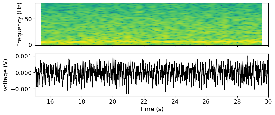
We might also be interested in how the frequency content of the signal varies over time. In a neural context, power in different frequency bands is often linked to specific types of processing, so we might explore whether changes in the spectrum coincide with specific behaviors or stimuli.
The spectrogram is an estimate of the power spectrum computed in a sliding time window, producing a 2D representation of the signal power across frequency and time.
fs
1249.9994033027313
help(scipy.signal.spectrogram)
Show code cell output
Help on function spectrogram in module scipy.signal._spectral_py:

spectrogram(x, fs=1.0, window=('tukey', 0.25), nperseg=None, noverlap=None, nfft=None, detrend='constant', return_onesided=True, scaling='density', axis=-1, mode='psd')
    Compute a spectrogram with consecutive Fourier transforms.

    Spectrograms can be used as a way of visualizing the change of a
    nonstationary signal's frequency content over time.

    Parameters
    ----------
    x : array_like
        Time series of measurement values
    fs : float, optional
        Sampling frequency of the `x` time series. Defaults to 1.0.
    window : str or tuple or array_like, optional
        Desired window to use. If `window` is a string or tuple, it is
        passed to `get_window` to generate the window values, which are
        DFT-even by default. See `get_window` for a list of windows and
        required parameters. If `window` is array_like it will be used
        directly as the window and its length must be nperseg.
        Defaults to a Tukey window with shape parameter of 0.25.
    nperseg : int, optional
        Length of each segment. Defaults to None, but if window is str or
        tuple, is set to 256, and if window is array_like, is set to the
        length of the window.
    noverlap : int, optional
        Number of points to overlap between segments. If `None`,
        ``noverlap = nperseg // 8``. Defaults to `None`.
    nfft : int, optional
        Length of the FFT used, if a zero padded FFT is desired. If
        `None`, the FFT length is `nperseg`. Defaults to `None`.
    detrend : str or function or `False`, optional
        Specifies how to detrend each segment. If `detrend` is a
        string, it is passed as the `type` argument to the `detrend`
        function. If it is a function, it takes a segment and returns a
        detrended segment. If `detrend` is `False`, no detrending is
        done. Defaults to 'constant'.
    return_onesided : bool, optional
        If `True`, return a one-sided spectrum for real data. If
        `False` return a two-sided spectrum. Defaults to `True`, but for
        complex data, a two-sided spectrum is always returned.
    scaling : { 'density', 'spectrum' }, optional
        Selects between computing the power spectral density ('density')
        where `Sxx` has units of V**2/Hz and computing the power
        spectrum ('spectrum') where `Sxx` has units of V**2, if `x`
        is measured in V and `fs` is measured in Hz. Defaults to
        'density'.
    axis : int, optional
        Axis along which the spectrogram is computed; the default is over
        the last axis (i.e. ``axis=-1``).
    mode : str, optional
        Defines what kind of return values are expected. Options are
        ['psd', 'complex', 'magnitude', 'angle', 'phase']. 'complex' is
        equivalent to the output of `stft` with no padding or boundary
        extension. 'magnitude' returns the absolute magnitude of the
        STFT. 'angle' and 'phase' return the complex angle of the STFT,
        with and without unwrapping, respectively.

    Returns
    -------
    f : ndarray
        Array of sample frequencies.
    t : ndarray
        Array of segment times.
    Sxx : ndarray
        Spectrogram of x. By default, the last axis of Sxx corresponds
        to the segment times.

    See Also
    --------
    periodogram: Simple, optionally modified periodogram
    lombscargle: Lomb-Scargle periodogram for unevenly sampled data
    welch: Power spectral density by Welch's method.
    csd: Cross spectral density by Welch's method.

    Notes
    -----
    An appropriate amount of overlap will depend on the choice of window
    and on your requirements. In contrast to welch's method, where the
    entire data stream is averaged over, one may wish to use a smaller
    overlap (or perhaps none at all) when computing a spectrogram, to
    maintain some statistical independence between individual segments.
    It is for this reason that the default window is a Tukey window with
    1/8th of a window's length overlap at each end.

    .. versionadded:: 0.16.0

    References
    ----------
    .. [1] Oppenheim, Alan V., Ronald W. Schafer, John R. Buck
           "Discrete-Time Signal Processing", Prentice Hall, 1999.

    Examples
    --------
    >>> import numpy as np
    >>> from scipy import signal
    >>> from scipy.fft import fftshift
    >>> import matplotlib.pyplot as plt
    >>> rng = np.random.default_rng()

    Generate a test signal, a 2 Vrms sine wave whose frequency is slowly
    modulated around 3kHz, corrupted by white noise of exponentially
    decreasing magnitude sampled at 10 kHz.

    >>> fs = 10e3
    >>> N = 1e5
    >>> amp = 2 * np.sqrt(2)
    >>> noise_power = 0.01 * fs / 2
    >>> time = np.arange(N) / float(fs)
    >>> mod = 500*np.cos(2*np.pi*0.25*time)
    >>> carrier = amp * np.sin(2*np.pi*3e3*time + mod)
    >>> noise = rng.normal(scale=np.sqrt(noise_power), size=time.shape)
    >>> noise *= np.exp(-time/5)
    >>> x = carrier + noise

    Compute and plot the spectrogram.

    >>> f, t, Sxx = signal.spectrogram(x, fs)
    >>> plt.pcolormesh(t, f, Sxx, shading='gouraud')
    >>> plt.ylabel('Frequency [Hz]')
    >>> plt.xlabel('Time [sec]')
    >>> plt.show()

    Note, if using output that is not one sided, then use the following:

    >>> f, t, Sxx = signal.spectrogram(x, fs, return_onesided=False)
    >>> plt.pcolormesh(t, fftshift(f), fftshift(Sxx, axes=0), shading='gouraud')
    >>> plt.ylabel('Frequency [Hz]')
    >>> plt.xlabel('Time [sec]')
    >>> plt.show()
f, t_spec, spec = scipy.signal.spectrogram(v, fs=fs, window='hann',
                            nperseg=1000, noverlap=1000-1, mode='psd')
# Scipy assumes our signal starts at time=0, so we need to provide the offset
t_spec = t_spec + t[0]
We’ll use the matplotlib pcolormesh function to visualize this data as an
image. We can pass this function x and y coordinates to get the axis labeling
right. We also log-transform the power spectrum and restrict to frequencies less
than 100 Hz.
fmax = 80
x, y = t_spec, f[f<fmax]
plot_data = np.log10(spec[f<fmax])
We’ll plot the spectrum together with the raw signal in subplots. Note that we explicitly link the x-axis limits to align the plots.
from matplotlib import cm
f, axs = plt.subplots(2, 1, sharex = True, figsize=(10,4)) # X axes are linked
time_window = [15, 30]

_ = axs[0].pcolormesh(x, y, plot_data)
_ = axs[0].set_ylabel('Frequency (Hz)')

_ = axs[1].plot(t, v, 'k')
_ = axs[1].set_xlim(time_window)
_ = axs[1].set_xlabel('Time (s)')
_ = axs[1].set_ylabel('Voltage (V)')
Exploring pre-computed current source density plots#
LFP data is commonly used to generate current source density (CSD) plots, which show the location of current sources and sinks along the probe axis. CSD analysis benefits from high spatial resolution, since it involves taking the second spatial derivative of the data. Because of Neuropixels dense site spacing, these probes are optimal for computing the CSD. However, the LFP data available through the AllenSDK has been spatially downsampled prior to NWB packaging.
To provide access to a high-resolution CSD plot, we’ve pre-computed the CSD in response to a flash stimulus for all probes with LFP.
csd = session.get_current_source_density(probe_id)
csd
<xarray.DataArray 'CSD' (virtual_channel_index: 384, time: 875)>
array([[  58327.03371574,   20117.6298887 ,  -14617.79294315, ...,
        -179410.38257756, -140541.81597896,  -99855.52022176],
       [ -65434.3204571 ,  -32932.62888488,   -3367.24904473, ...,
         161433.08930627,  136244.74051173,  109671.1407354 ],
       [  28505.59773412,   31288.43801342,   33892.68350592, ...,
          39946.37351702,   24588.34919833,    8571.48977541],
       ...,
       [  -3201.28149464,   -1289.03683893,     502.04419085, ...,
           -943.9933153 ,   -2669.37931577,   -4375.39738216],
       [ -32827.35201643,  -16409.56190898,   -1052.05581321, ...,
        -106129.85783238,  -94380.54770586,  -82251.01882374],
       [  34153.87655675,   16950.77633742,     815.89811501, ...,
          94579.10700446,   89217.81476538,   83741.3728981 ]])
Coordinates:
  * virtual_channel_index  (virtual_channel_index) int64 0 1 2 3 ... 381 382 383
  * time                   (time) float64 -0.1 -0.0996 -0.0992 ... 0.2492 0.2496
    vertical_position      (virtual_channel_index) float64 0.0 10.0 ... 3.83e+03
horizontal_position (virtual_channel_index) float64 24.0 24.0 ... 24.0The CSD object is a DataArray with dimensions of channels x time. Note that
the channels are actually “virtual channels,” based on interpolated signals
along the central axis of the probe, with 10 micron inter-site spacing.
from scipy.ndimage.filters import gaussian_filter

filtered_csd = gaussian_filter(csd.data, sigma=(5,1))

f, ax = plt.subplots(figsize=(6, 6))

_ = ax.pcolor(csd["time"], csd["vertical_position"], filtered_csd, vmin=-3e4, vmax=3e4)
_ = ax.set_xlabel("time relative to stimulus onset (s)")
_ = ax.set_ylabel("vertical position (um)")
/tmp/ipykernel_8159/685657192.py:1: DeprecationWarning: Please use `gaussian_filter` from the `scipy.ndimage` namespace, the `scipy.ndimage.filters` namespace is deprecated.
  from scipy.ndimage.filters import gaussian_filter
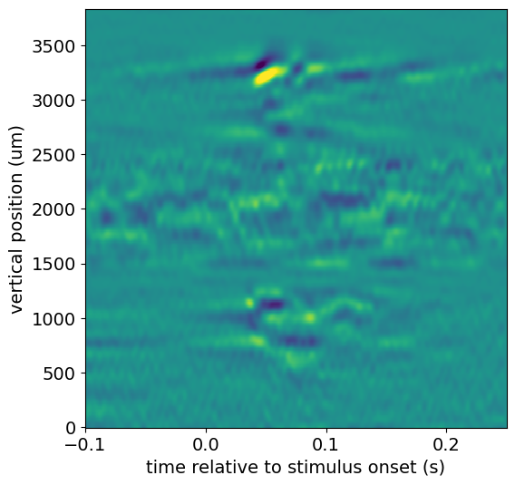
This CSD shows a clear stimulus-evoked response in cortex (2600-3500 microns), with an even earlier response in a subcortical region (700-1200 microns).
We can use the channels table to figure out where this signal is coming from:
list(session.channels[(session.channels.probe_id == probe_id) &
                 (session.channels.probe_vertical_position > 700) &
                 (session.channels.probe_vertical_position < 1200)].ecephys_structure_acronym.unique())
['LP', 'LGd']
It looks like this region of the probe is on the border between LGd and LP nuclei in the thalamus.
Suggestions for further analysis#
How does the cortical CSD vary across visual areas? Are there consistent patterns across all areas?
Are the locations of sources and sinks correlated with other features of the LFP, such as power in different frequency bands?
